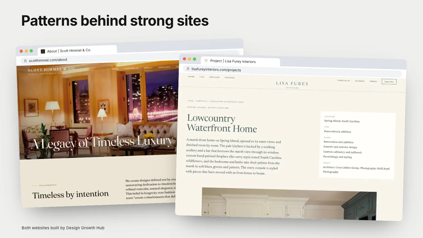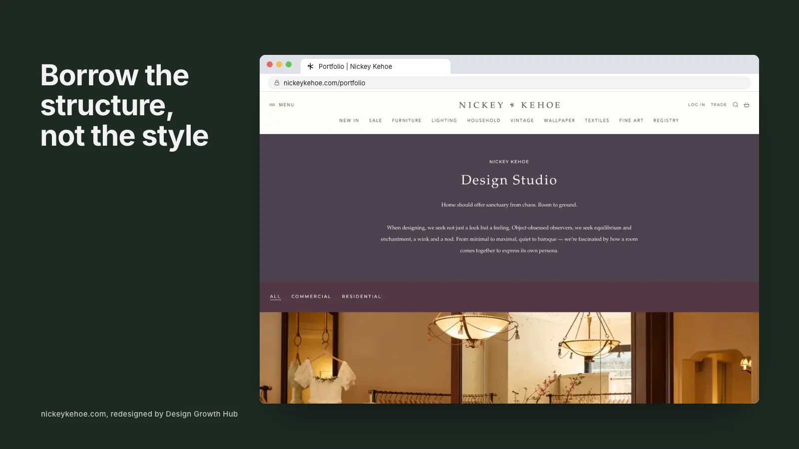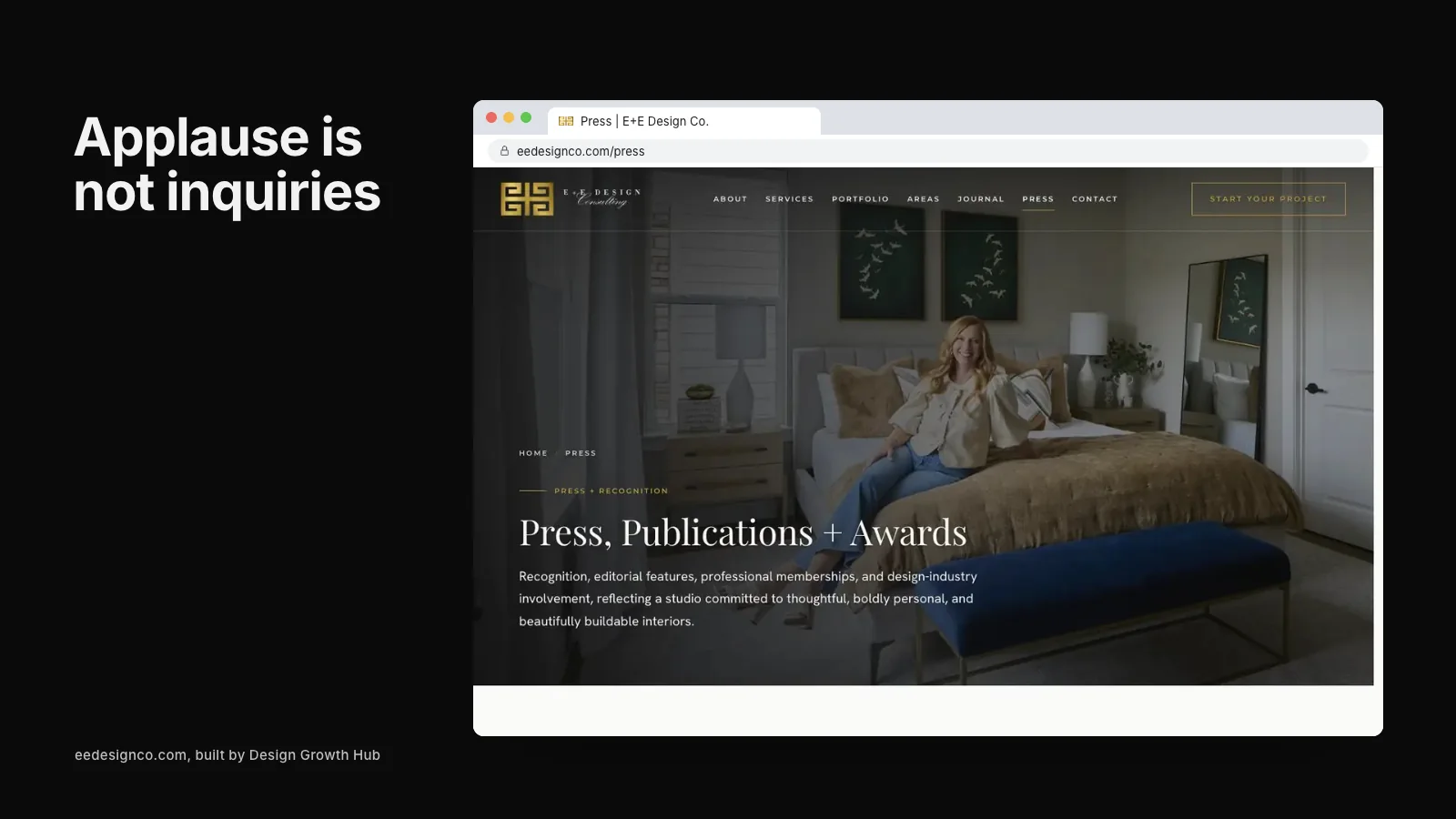
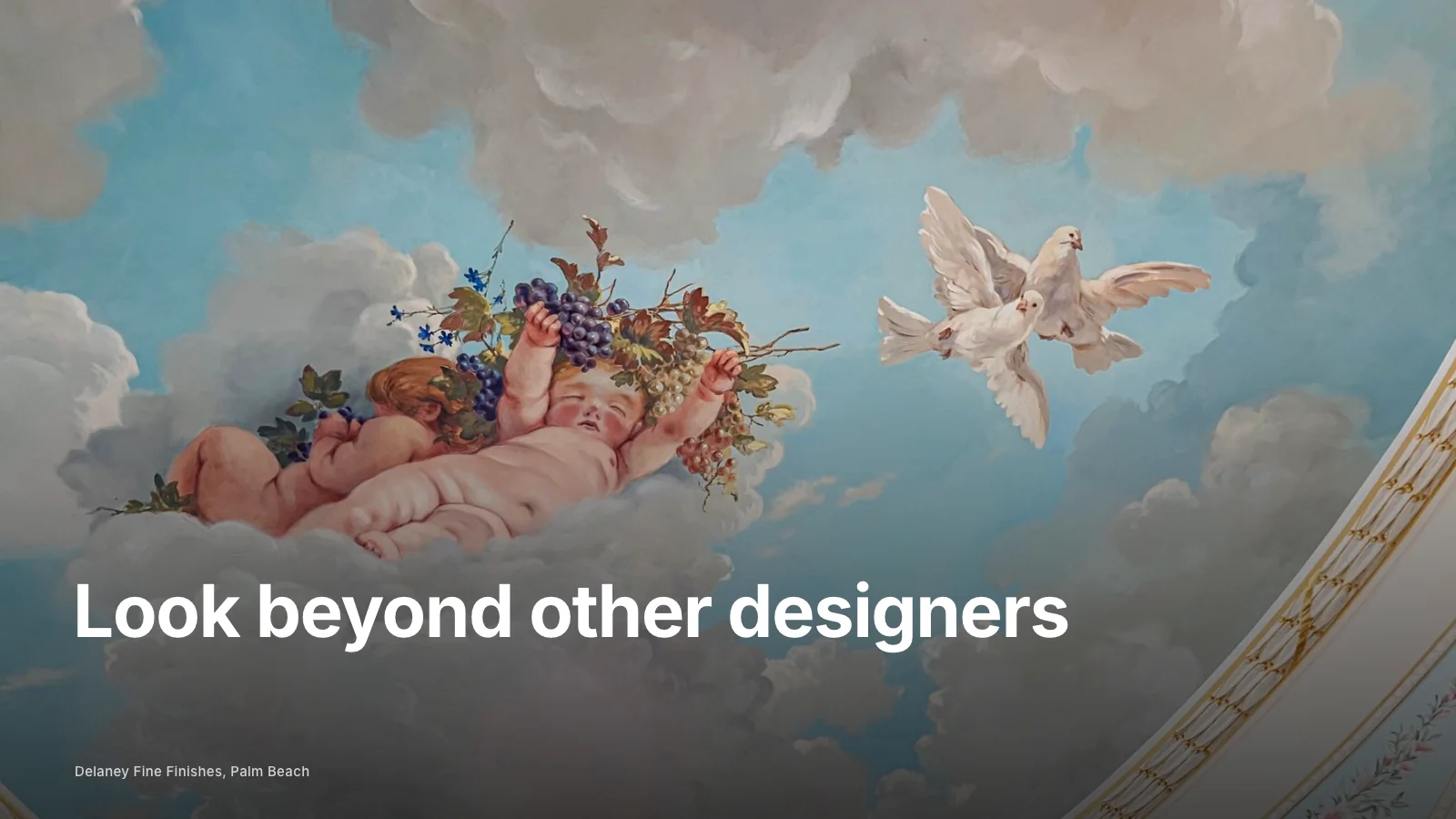
The most useful interior design website inspiration rarely comes from scrolling through other designers' homepages. Those sites are a good reference, but borrowing from them tends to produce a website that looks like everyone else in your market. The studios with the most distinctive sites usually draw ideas from editorial magazines, galleries, boutique hotels, architects and fashion houses, then adapt those ideas to their own work.
Here is where to look, what to collect and how to turn a folder of screenshots into a website that feels like yours.
Start with the feeling you want clients to have
Before you collect anything, write three or four words that describe how you want a visitor to feel after a minute on your site. Calm and assured. Warm and personal. Bold and collected. Those words become a filter. When you see a website you like, you can ask whether it creates that feeling or simply looks impressive.
This step matters because inspiration hunting can easily become a search for the most striking design rather than the most fitting one. A dramatic, fast-moving site might be beautiful and still feel wrong for a studio known for quiet, layered interiors.
Editorial magazines and their websites
Shelter magazines have spent decades learning how to present rooms. Look at how printed features pace a story: a wide establishing shot, a close detail, a portrait of the homeowner, then a few paragraphs before the next image. That rhythm translates well to project pages.
Magazine websites also show how to write captions that add meaning rather than repeating what is visible. Notice how they name the designer, the room, a key material or a maker. That kind of caption is exactly what helps visitors, search engines and AI tools understand your work. Our guide to building an interior design portfolio website shows how to apply this pacing to your own projects.
Galleries, museums and auction houses
Gallery websites are masters of restraint. They give each work space to breathe, use type sparingly and let a single image lead. For a studio that wants its photography to carry the experience, they are a better reference than most design websites.
Auction house catalogs are worth a look too. They show how to present objects with dignity: a strong image, a clear title and a short, specific description. If you sell products, or plan to, this is useful thinking. Our article on whether an interior design website should sell products online covers when a shop belongs on your site.
Boutique hotels and restaurants
Hospitality brands sell an atmosphere before anyone has visited. Their websites tend to be excellent at setting a mood with very few words, guiding people to a single action and working beautifully on phones. Pay attention to how they handle booking, because the same principles apply to your inquiry form: few steps, clear expectations and reassurance at each stage.
Architects and landscape designers
Architecture firm websites often handle long project archives with real clarity, using filters, project facts and short essays. If you work on new construction or large renovations, their approach to project data is worth studying. Our piece on architecture firm website examples looks at several patterns that transfer well to design studios.
Other design studios, used carefully
It is still worth looking at strong interior design websites, especially to understand what your clients have already seen. Just study them for structure rather than style. How do they introduce services? How do they tell project stories? How many steps does it take to inquire? Our collection of interior design website examples focuses on exactly these questions.
Design awards sites can be a good shortcut to well-made work, although award-winning sites are sometimes more experimental than a studio needs. Our article on interior design website awards explains what they reward and what they ignore.
How to build a useful swipe file
A folder of screenshots becomes useful when every item has a note. For each example, write one line about what you want to borrow and why. Group them into a few categories:
- First impressions: opening screens, taglines and how the work is introduced.
- Project storytelling: pacing, captions, project facts and galleries.
- Typography and color: combinations that match your words from the first step.
- Navigation and inquiry: menus, contact pages and calls to action.
- Details: hover states, transitions, image treatments and footers.
Five to ten strong references in each group is plenty. More than that usually means you have not decided yet.
Fonts and colors deserve their own look
Type and color shape a site more than most people realize. A refined serif and a warm off-white produce a very different feeling from a geometric sans-serif and pure black. Our guides to choosing fonts for an interior design website and building a website color palette go deeper. The short version is to choose type that is easy to read at length and colors that let your photography lead.
Motion, used with intention
Subtle motion can make a site feel crafted: images that fade in gently, a smooth page transition, a project that reveals as you scroll. Too much motion makes it slow and tiring. If an example uses animation, note whether it helps you understand the work or simply decorates the page. Our article on animated interior design websites weighs this in more detail.
Turning inspiration into a plan
Inspiration only becomes useful when it is translated into decisions. Once your swipe file feels settled, write a simple page list and decide what each page needs to say. Then gather the photography and words for your best projects. Our step-by-step guide to creating an interior design website walks through that order, and what an interior design company website should include gives a checklist so nothing important is missed.
If you would like help turning your references into a finished site, our website creation service starts with exactly this kind of review. Or simply request a studio review and send us the sites you admire along with your own.
Request a Studio Review
If your work is already strong, the next step is making sure Google + AI can understand it clearly.
Request a Studio Review