The best fonts for an interior design website are ones that are beautiful and easy to read at length, on every screen. For most studios, that means one or two type families, used at a generous size with comfortable spacing and strong contrast. A refined serif or a clean sans-serif can both work well. What matters most is that the type supports your photography and makes your words effortless to read.
Here is how to choose, pair and use fonts well, and the mistakes that make otherwise beautiful sites hard to use.
Why fonts matter so much
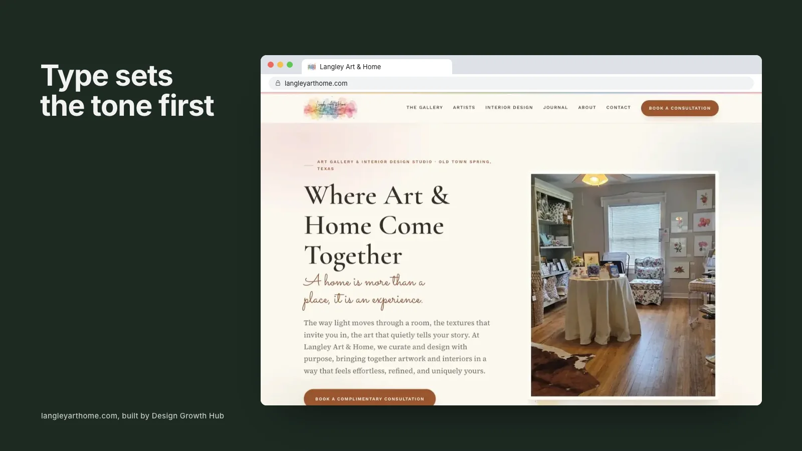
Before a visitor reads anything, they register the shape of the letters. Typography sets a tone: classic, modern, warm, crisp, playful or serious. On a design website, where clients are judging your taste, that impression counts.
But typography is also functional. If text is hard to read, visitors skim, miss important information or leave. Beautiful type that is difficult to read is a poor trade.
Serif or sans-serif?
Serif fonts, with small strokes at the ends of letters, often feel classic and editorial. Sans-serif fonts feel cleaner and more contemporary. Neither is right for every studio.
- Serif: suits studios with a traditional, editorial or literary feel. Works well for headings and can work for body text at generous sizes.
- Sans-serif: suits modern, architectural or minimal studios. Very readable on screens at most sizes.
- A pairing: many sites use a serif for headings and a sans-serif for body text, or the reverse.
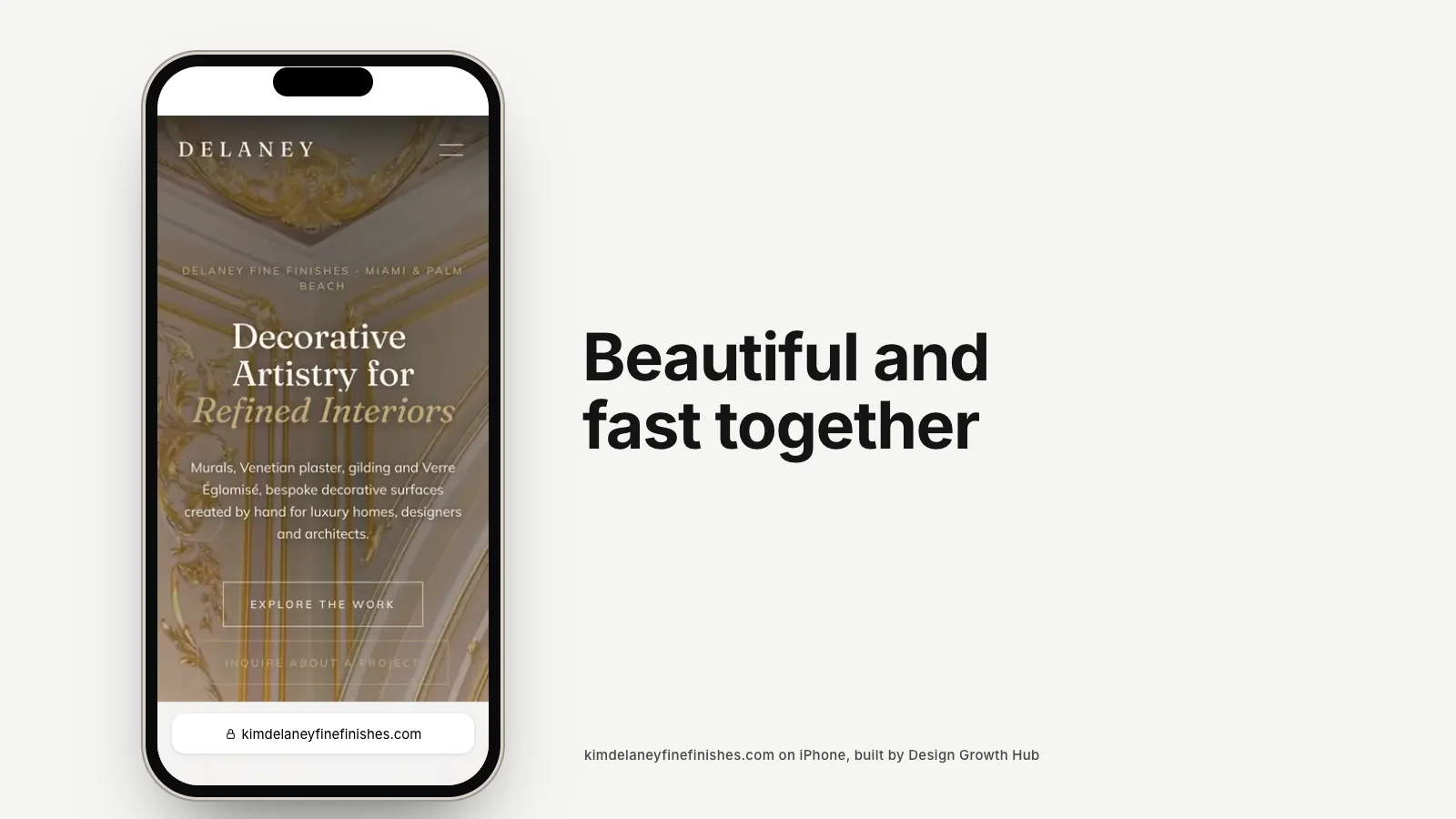
Whatever you choose, it should match the feeling of your work. A studio known for warm, layered interiors may suit a softer serif. A studio known for clean, architectural spaces may suit a crisp sans-serif.
Readability comes first
- Size: body text should be comfortable to read on a phone without zooming. Many well-designed sites use larger body text than people expect.
- Line spacing: generous space between lines makes paragraphs easier to follow.
- Line length: very long lines are tiring. Keep text columns to a comfortable width.
- Contrast: dark text on a light background, or light on dark, with enough difference to read in daylight.
- Weight: very thin fonts look elegant in mockups but often disappear on real screens.
Light gray text in a thin, small font is one of the most common problems on design websites. It looks refined in a presentation and becomes frustrating on a phone outdoors.
Pairing fonts
If you use two fonts, choose ones with clear contrast and a shared sensibility. A classic serif heading with a clean sans-serif body is a reliable combination. Avoid pairing two fonts that are similar but not identical, which can look like a mistake.
Limit yourself to two families at most. Variety can come from size, weight and spacing within those families.
Fonts that work well on screens
Some fonts are designed specifically for screens and remain clear at small sizes. Widely used families such as Inter, Source Sans, Libre Franklin and others in the Google Fonts library are well tested and free to use. Many premium foundries offer refined serifs and sans-serifs with web licenses as well.
Test any font with your real content: a heading, a paragraph of project story and a caption, viewed on a phone and a laptop.
Licensing
Fonts are software, and most require a license for website use. Free libraries such as Google Fonts cover web use. Commercial fonts usually need a specific web license, sometimes priced by traffic. Check before building your site around a font, especially if a designer suggests one from a desktop library.
Performance
Every font file adds weight to your pages. Loading many weights and styles can slow the first view, especially on mobile. Use only the weights you need, load them efficiently and make sure text is visible while fonts load. Speed affects both experience and search, as explained in our article on page speed and SEO.
Typography details that feel refined
- Consistent heading sizes across pages.
- Comfortable spacing above and below headings.
- Captions in a smaller size but still easy to read.
- Restrained use of all-caps, mainly for short labels.
- Careful letter spacing on headings and labels.
These details are subtle, but together they create the feeling of a carefully designed site.
Fonts and your brand
Your website type should feel connected to your logo and printed materials without necessarily using the same fonts. A logo typeface is often too distinctive for body text. Choose website fonts that complement it. Our articles on website color palettes and interior design brand guidelines cover the wider visual system.
Where fonts fit in the bigger build
Typography is one part of a website that needs clear structure and strong content. Our guides to creating an interior design website step by step and what an interior design company website should include cover the rest, and our article on the interior design website guide for growing studios explains how design choices support business goals. If motion is part of your plans, animated interior design websites discusses how type and animation interact. For shop pages, interior design ecommerce websites has notes on product typography. And building a portfolio website shows how type supports project stories.
If your current site feels hard to read or not quite as refined as your work, our website redesign service can update typography alongside layout and content. Or request a studio review and we will tell you what would make the biggest difference.
Build your visibility foundation
Design Growth Hub helps interior designers build the visibility foundation behind high-value discovery.
Request a Studio Review