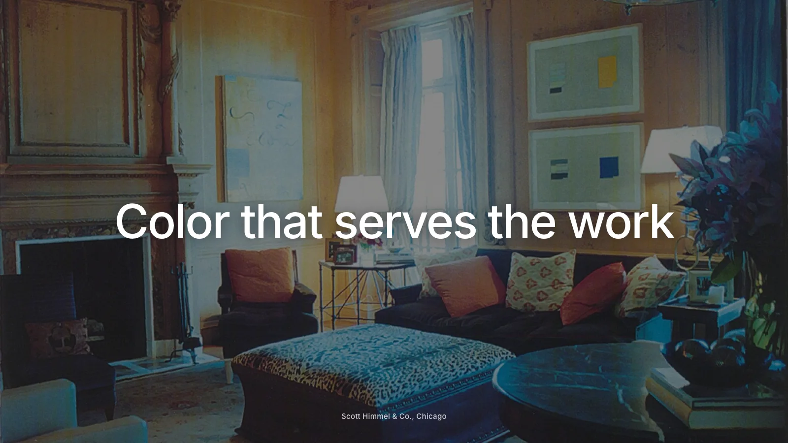
The best color palette for an interior design website is restrained: a background and text color with strong contrast, one or two supporting neutrals and a single accent drawn from your brand. The goal is to let your project photography carry the color while the website frames it calmly. A palette that competes with your images, or that makes text hard to read, undermines both.
Here is how to build a palette that feels personal without getting in the way.
Start with your photography
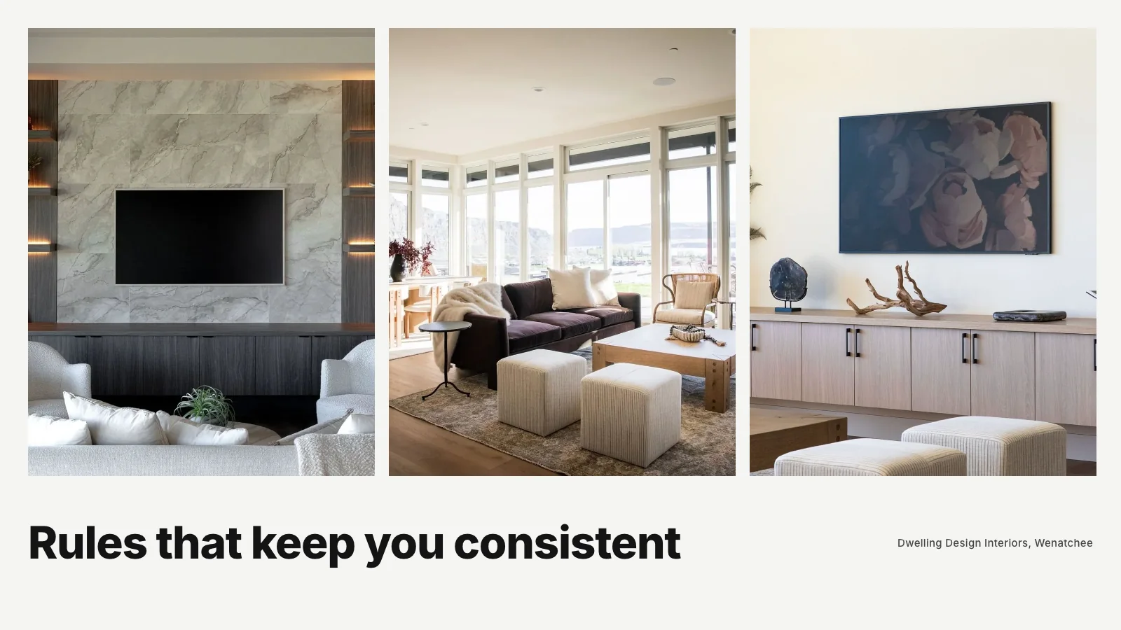
Lay out twenty of your best project photos and look at them together. What colors appear most often? Warm woods and creams, cool grays and blues, rich greens, crisp whites? Your website palette should sit comfortably beside these images. If your work is warm and layered, a stark blue-white background may feel jarring. If your work is cool and architectural, a warm cream might soften it in the wrong way.
The aim is not to match your photos exactly. It is to choose colors that let them look their best.
Choose the background first
The background color covers more of your site than anything else. Most design studios choose one of three directions:
- White or near-white: clean, gallery-like and lets photos stand out. A very slightly warm or cool white can add character.
- A soft neutral: a gentle tone such as stone or pale gray can feel warmer, but needs careful testing so text stays readable.
- Deep black or charcoal: dramatic and editorial, especially for studios with moody, rich work. Requires light text with enough contrast.
Whichever you choose, keep it consistent across pages. Switching backgrounds section by section can make a site feel restless.
Choose a text color with strong contrast
Text must be easy to read. On a light background, near-black usually works best. On a dark background, near-white. Avoid mid-gray text on white or light text on beige, which can look refined in a mockup and become hard to read on a phone in daylight.
Accessibility guidelines recommend a minimum contrast between text and background, and free tools can check your colors in seconds. Meeting that standard helps everyone, not only people with visual impairments.
Add one accent
An accent color adds personality. It might come from your logo, a material you love or a color that appears often in your work. Use it sparingly: for buttons, links, small labels or a thin rule. When an accent appears everywhere, it stops feeling special.
Good accents for design studios are often deep and natural: an olive green, a terracotta, an ink blue, a muted gold. Bright, saturated colors can work for playful brands but are harder to use with interior photography.
Supporting neutrals
You may need one or two supporting shades for backgrounds of particular sections, borders and secondary text. Choose them from the same family as your main colors so the palette feels coherent. A slightly darker version of your background for a press section, for example, can create variety without adding new colors.
Test with real content
Colors behave differently on real pages than in swatches. Build a home page and a project page with your actual photography and text, then view them on a phone, a laptop and in different light. Adjust until text is comfortable, photos look natural and the overall feeling matches your work.
Think about dark mode
Some visitors browse with dark mode turned on. Many websites ignore it, which is fine, but if you choose a light palette, make sure nothing breaks when a device applies its own dark settings. If you choose a dark palette, check that it remains comfortable for long reading.
Keep the palette consistent
Write down your colors with their exact codes and use them everywhere: website, proposals, social graphics and printed materials. Consistency builds recognition. Our guide to interior design brand guidelines explains how to document this simply.
Mistakes to avoid
- Too many colors: each section in a different tone makes a site feel scattered.
- Low contrast text: stylish in presentations, frustrating in real use.
- Colored backgrounds behind photos: they can distort how your work looks.
- Following trends blindly: this year's fashionable shade may age quickly.
- Ignoring buttons: if your button color does not stand out, visitors may miss it.
How color works with typography
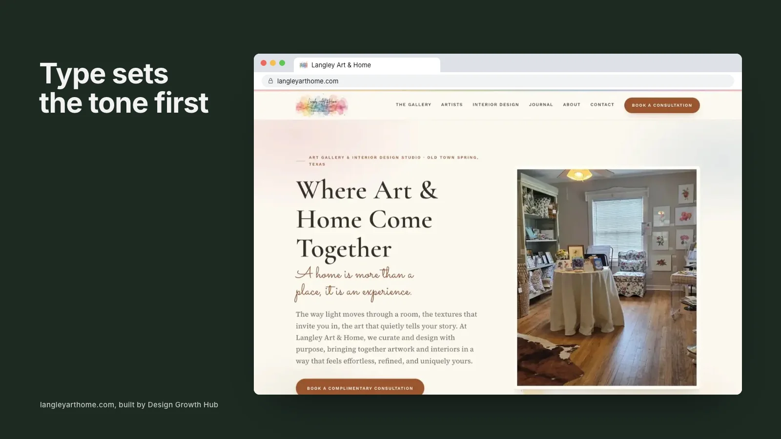
Color and type work together. A thin, light font in a pale color is doubly hard to read. A confident font in strong contrast feels clear and assured. Our guide to choosing fonts for an interior design website covers type, and the two decisions are best made together.
How color affects trust
Clients rarely notice a good palette consciously, but they feel it. A calm, consistent palette suggests care and control, which is exactly what clients want from someone managing their home. A chaotic or dated palette suggests the opposite. For high-end studios, restraint is usually the safest path, as explored in our article on what makes a luxury interior design website feel luxury.
Where color fits in a full build
Palette choices are part of a wider design and structure process. Our guides to creating an interior design website step by step, what an interior design company website should include, building a portfolio website and the website guide for growing studios cover the rest. If you plan to add motion, our piece on animated interior design websites discusses how color and animation interact. If you sell products, interior design ecommerce websites touches on how product photography and palette work together.
If your current palette feels dated or makes your work look flat, our website redesign service can refresh it as part of a wider update. Or request a studio review and we will suggest what to change.
Make your studio easier to find
When the right clients search, clarity is what brings them to you. Let us look at the structure behind how you are found.
Request a Studio Review