A luxury interior design website feels high-end because of restraint, not decoration. Generous space, editorial photography, refined typography, confident and specific writing and an experience that never makes a visitor work hard. High-end clients are used to being looked after, and the best studio websites quietly do exactly that from the first screen to the inquiry.
This article breaks down where that feeling comes from and where many luxury studio sites accidentally undermine it.
Luxury is a feeling, not a style
There is no single luxury aesthetic. A Palm Beach studio and a Chicago architecture-led firm can both feel luxurious while looking completely different. What they share is a sense of composure. Nothing feels rushed, crowded or uncertain. Every element appears to have been chosen.
That composure is easy to lose. Too many fonts, a dozen competing calls to action, autoplaying video and slow pop-ups all make a site feel anxious. The more expensive the work, the more important it is that the website feels calm.
Photography carries the weight
At this level, photography is non-negotiable. Look for images that feel editorial: natural light, considered styling, a mix of wide views and intimate details. Present them large and give them room. Resist the urge to show everything. A tight selection of extraordinary images says more than a long gallery of good ones.
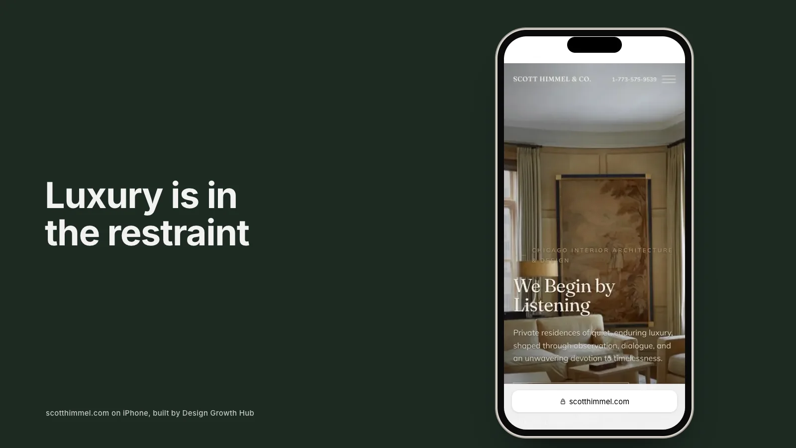
Scott Himmel & Co. in Chicago is a good example. With decades of published work, the site lets full-width photography lead, with a filterable portfolio of 24 projects and press and honors gathered on a calm About page. You can see the approach in the Scott Himmel case study.
Typography and color set the tone
Refined typography is one of the quickest ways to make a site feel high-end, and one of the easiest to get wrong. Choose type that is beautiful and easy to read at length, at a generous size, with plenty of line spacing. Limit yourself to one or two families.
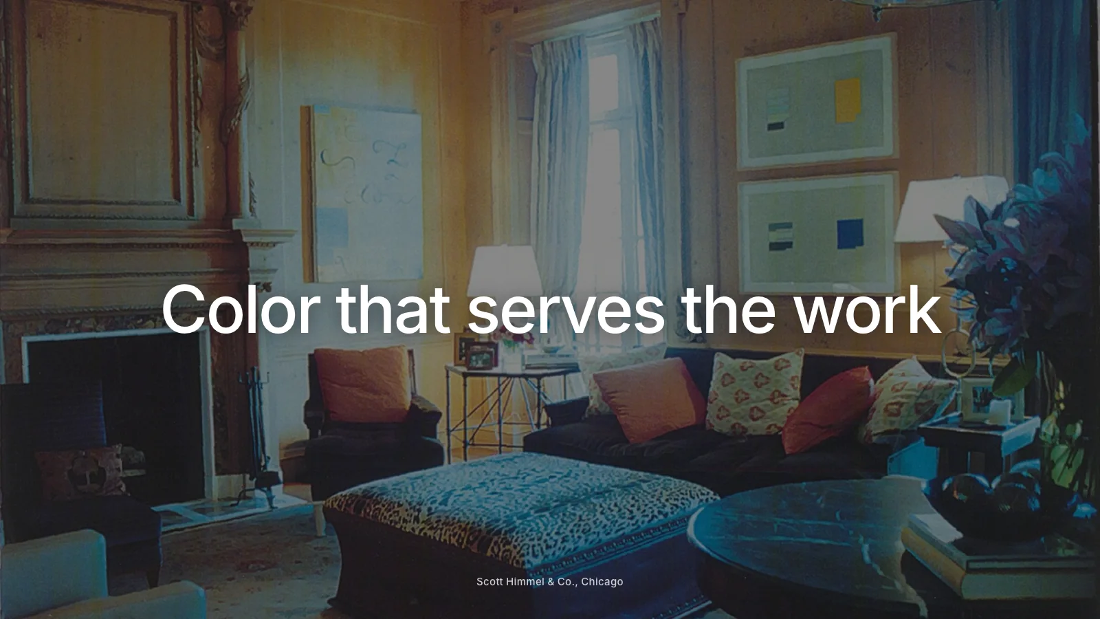
Color should support the photography rather than compete with it. Many luxury sites use a restrained palette of near-white, deep black and one accent drawn from the brand. Our guides to website fonts and website color palettes cover both in more depth.
Writing that sounds like a trusted advisor
Luxury writing is specific and quiet. It does not oversell. Instead of "breathtaking, one-of-a-kind spaces", a high-end studio might write about restoring a 1920s limestone house for a family of five, the furniture makers it works with and how it manages complex renovations. Specificity signals experience. Superlatives signal insecurity.
This applies across the site, from the home page to project captions. If you want to see how detail builds credibility, our article on using case studies to win better clients is a good place to start.
Proof, presented discreetly
High-end clients want reassurance that you have done this before at their level. The most effective proof is real and understated:
- A press strip with genuine publication logos, linked to features where possible.
- Awards and professional recognition, listed plainly.
- Short testimonials that describe the experience of working with you.
- Credits to respected architects, builders and makers you collaborate with.
- A clear description of your process, showing you manage complexity calmly.
Discretion matters too. Many luxury clients value privacy, so avoid identifying details in project stories unless clients have agreed.
Effortless navigation and speed
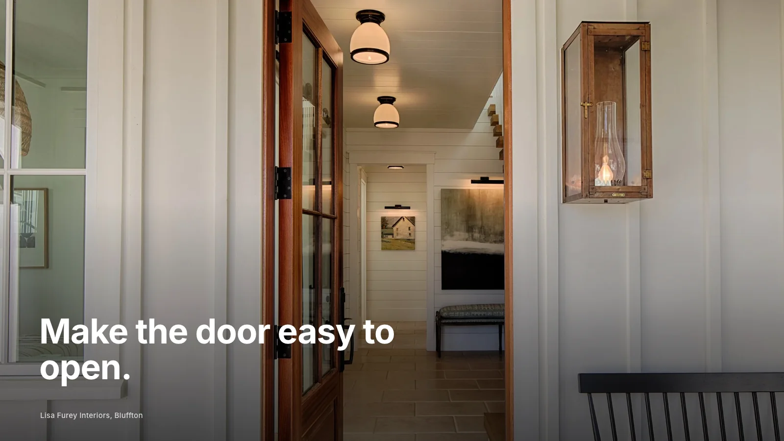
A luxury website should never make anyone hunt or wait. Navigation should be simple, the contact page easy to find and pages quick to load even with large photography. Slow pages undermine the impression of quality instantly, especially on phones. Speed is part of the experience, not a technical afterthought.
This is also where motion needs care. Gentle fades and smooth transitions can feel crafted. Heavy animation often feels like showing off and slows everything down. Our article on whether animated interior design websites help or hurt looks at the balance.
An inquiry experience that matches the service
The contact page is where many luxury sites fall short. A long, impersonal form or a generic "submit" button feels at odds with a bespoke service. Instead, ask a few thoughtful questions, explain what happens next and when you will reply, and offer an alternative such as email for those who prefer it. Our article on what your contact page may be costing you looks at common mistakes.
Visible to the right people
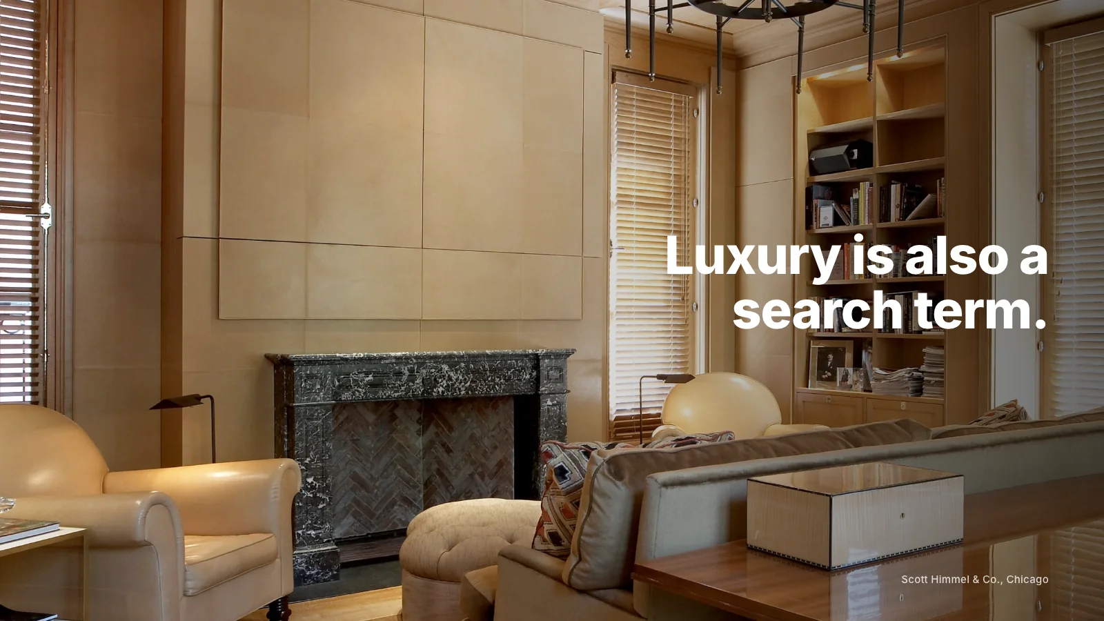
Luxury clients search too. They look for designers by project type, location and reputation, and increasingly ask AI tools for recommendations. A high-end site still needs clear service pages, accurate business details and written context on projects. Our guide to ranking as a luxury interior designer explains how.
Where to begin
If your current website feels less refined than your work, start with photography selection, typography and writing before anything else. Those three changes often transform the impression. For a deeper rebuild, our website redesign service is built around these principles, from portfolio structure to the pages a company website needs.
When you are ready, request a studio review and we will tell you what is holding your current site back from feeling as considered as your work.
See how Google + AI understand your studio
A beautiful portfolio matters. But if search engines and AI tools cannot connect your studio to the right searches, better-fit clients may never reach your website.
Request a Studio Review