Animated interior design websites help when motion is subtle and purposeful: images that fade in gently, smooth transitions between pages, quiet hover responses and reveals that guide attention. They hurt when animation delays reading, slows loading, distracts from the work or feels like showing off. The right approach uses motion to make the site feel crafted and calm, never to make visitors wait.
Here is how to tell the difference and how to use animation well.
Why motion appeals to designers
Designers care about atmosphere, and motion can create it. A gentle fade as a project image appears, a smooth transition between pages or a subtle parallax can make a site feel more like walking through a space than flipping through a catalog. Done well, motion signals craft.
Motion that helps
- Image fades: images appear softly as they load, avoiding harsh pops.
- Scroll reveals: sections ease into view as visitors scroll.
- Page transitions: smooth movement between pages that keeps orientation.
- Hover states: small responses when hovering over projects or buttons.
- Gentle parallax: subtle depth on large images, used sparingly.
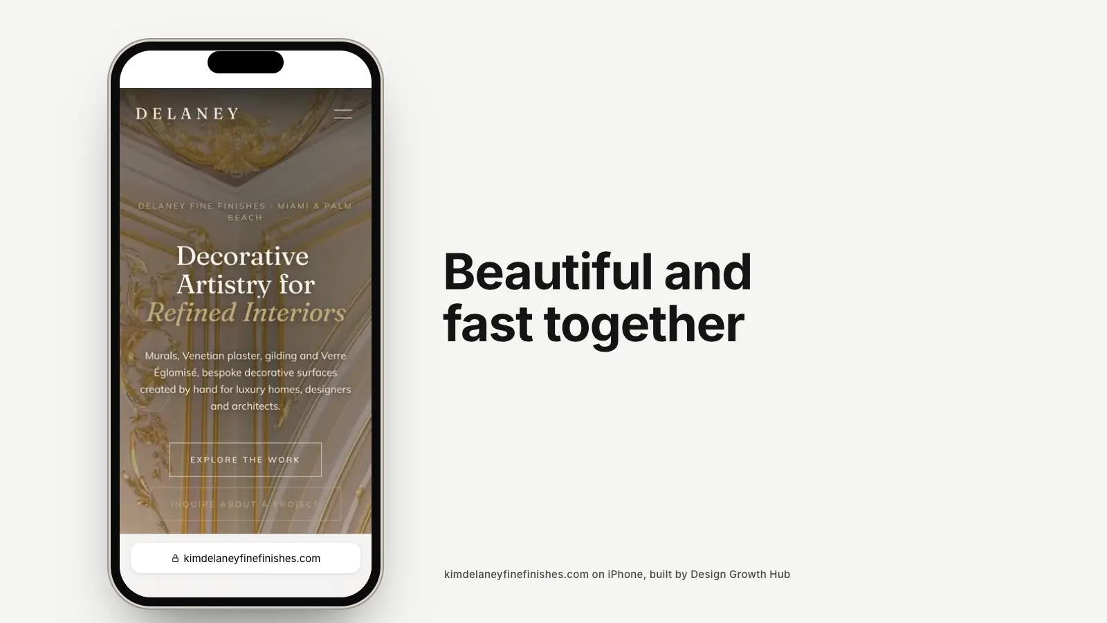
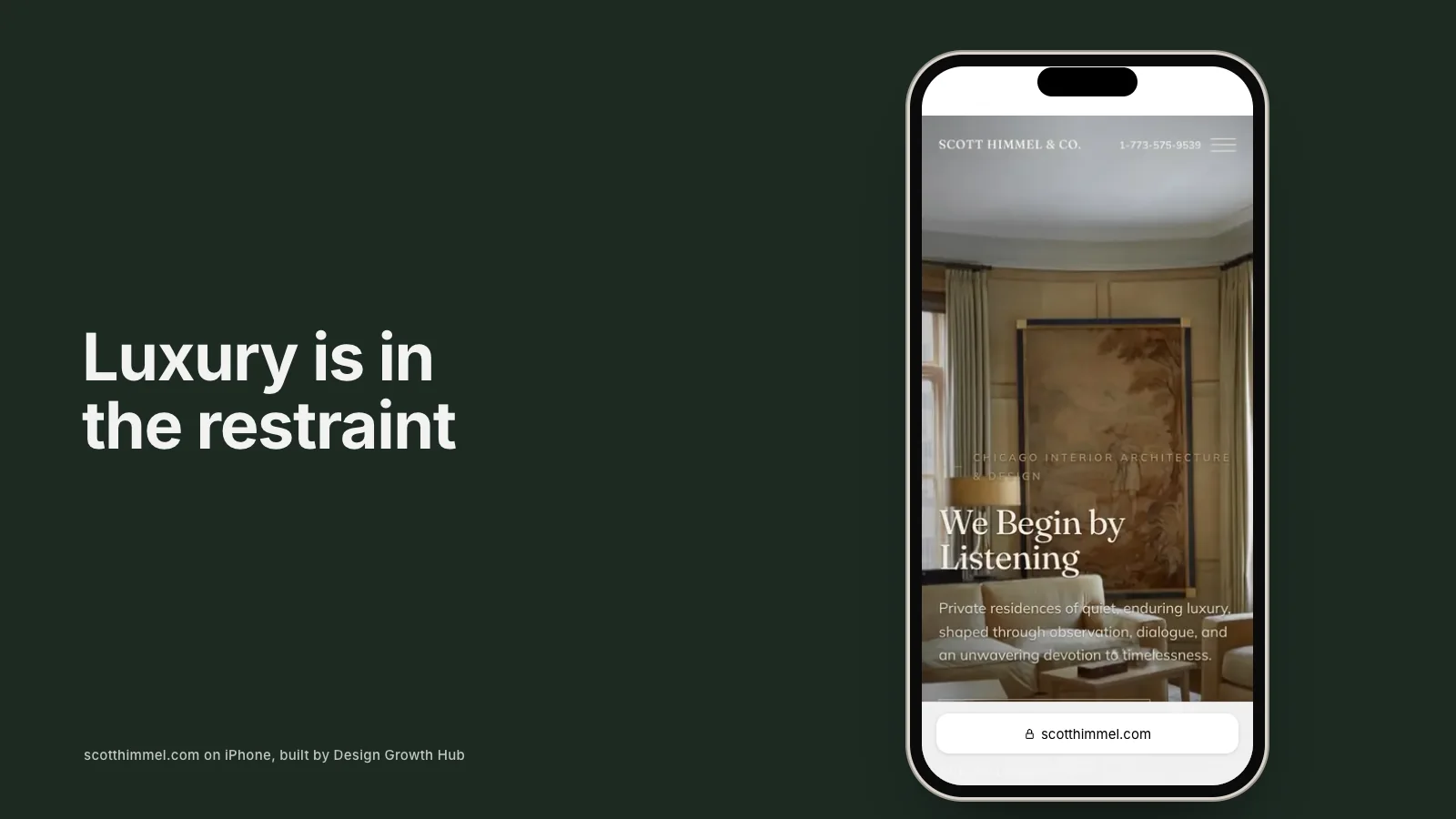
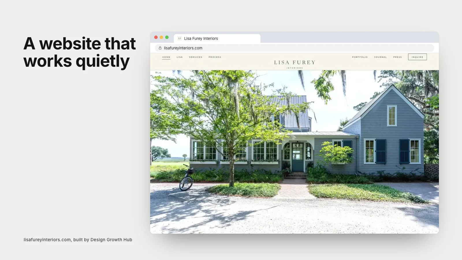
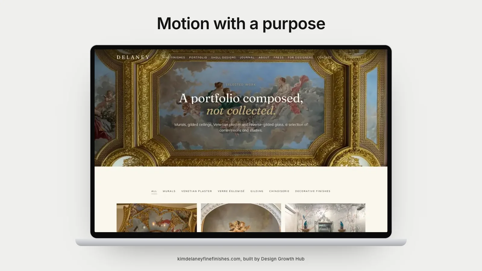
- Device previews: showing websites in motion on laptops and phones, where relevant.
These help because they support reading and browsing rather than interrupting them.
Motion that hurts
- Long intro animations that delay seeing any content.
- Text that animates in slowly, making visitors wait to read.
- Heavy effects that slow loading or stutter on phones.
- Autoplay video that uses data and distracts.
- Scroll hijacking, where the site controls scroll speed or direction.
- Constant movement that never lets the eye rest.
These harm the experience, especially for visitors on phones or slower connections.
Speed and motion
Animation adds code, and some effects demand significant processing. On a powerful laptop, everything may look smooth. On an older phone, the same site may stutter. Always test animations on real devices. If an effect slows the page or feels jerky, simplify or remove it. Our article on page speed and SEO explains why speed matters for visibility too.
Accessibility and reduced motion
Some visitors find motion uncomfortable or distracting, and many devices let people request reduced motion. Websites can respect this setting by turning off or simplifying animations for those visitors. It is a small technical step that makes your site more considerate.
Motion and search
Search engines need to read your content. If text only appears after animation, or is hidden behind effects, it may be harder for them to understand. Make sure all important text is present in the page and visible without relying on animation.
Motion and luxury
High-end brands often use motion sparingly. Calm, unhurried transitions suggest confidence. Fast, flashy effects can feel less refined. Our article on what makes a luxury website feel luxury explores this in depth.
How we approach motion
On the sites we build, motion is used to make browsing feel smooth: images that fade in as they load, gentle reveals as visitors scroll and device previews that show client websites in motion. Every effect is tested on phones and turned down for visitors who prefer reduced motion. The aim is a site that feels considered, not one that performs.
Motion on phones
Phones deserve particular attention. Many animations designed on a large screen feel cramped or jumpy on a small one. Parallax effects can make scrolling feel unstable, and large animated images can drain battery and data. A good approach is to keep motion even more restrained on mobile: simple fades, quick transitions and no effects that interfere with scrolling. Visitors on phones are often deciding quickly whether to keep looking, so smoothness matters more than spectacle.
Video versus animation
Video and animation are different tools. A short, well-shot video of a finished room can be beautiful on a project page when it loads only after the visitor chooses to play it. Autoplaying background video on the home page is riskier, because it adds weight before anything else appears. If you want video, place it where it adds meaning, keep it short and offer a still image as the first view.
Questions to ask about any animation
- Does it help visitors understand or enjoy the work?
- Does it delay reading or navigation?
- Does it load quickly and run smoothly on phones?
- Does it respect reduced motion settings?
- Would the site feel worse without it?
If the honest answer to the last question is no, the animation probably is not needed.
Motion in shops and portfolios
On product pages and portfolios, motion should support browsing. Smooth image galleries and quick transitions help. Effects that slow down adding to cart or flipping through images frustrate visitors. Our article on selling products on a design website covers shop experience.
Working with your designer or developer
Discuss motion early. Agree which effects support your brand, test them on real devices and confirm they respect accessibility settings. Our guides to creating an interior design website step by step, what a company website should include, building a portfolio website and the website guide for growing studios cover the wider build. If you are considering AI builders, which often add stock animations, our article on building with AI is worth reading.
If you would like a website that uses motion with restraint and care, our website redesign service can help. Or request a studio review and we will tell you whether your current animations help or hinder.
Make your studio easier to find
When the right clients search, clarity is what brings them to you. Let us look at the structure behind how you are found.
Request a Studio Review