An interior design website is the one place where a prospective client can see your work, understand how you work and decide whether to contact you, all without speaking to anyone. For a growing studio it carries more weight than any other marketing asset, because nearly every referral, Instagram follower and Google searcher ends up there before they inquire.
The trouble is that most design websites are built as galleries. They show beautiful rooms and very little else. This guide walks through what a studio website really needs, in the order a client experiences it, and where most sites quietly lose people.
What does an interior design website need to do?
A good studio website does four jobs at once. It proves taste through the work. It explains what you offer, for whom and where. It builds enough trust that a stranger feels safe sending a message. And it gives search engines and AI tools enough clear information to recommend you when someone searches for a designer.
Most sites handle the first job well and the other three poorly. A homeowner planning a whole-home renovation wants to know if you take projects like theirs, roughly how you work and whether people like them have hired you before. If those answers are missing, even a stunning portfolio leaves them guessing, and guessing clients rarely inquire.
The pages every interior design website needs
You do not need fifty pages to start. You do need the right ones, each with a clear purpose:
- Home page: who you are, what you do, where you work and one clear next step.
- Service pages: one page for each core service, such as full-service design, renovations or new construction.
- Portfolio and project pages: a page for each significant project, with photos and a short written story.
- About page: the people behind the studio, your approach and your experience.
- Press and recognition: features, awards and memberships, if you have them.
- Contact page: a short form and a sentence about what happens next.
If you want a deeper walkthrough of building these from scratch, our guide on how to create an interior design website step by step covers the order we recommend.
How to present projects so they sell the work
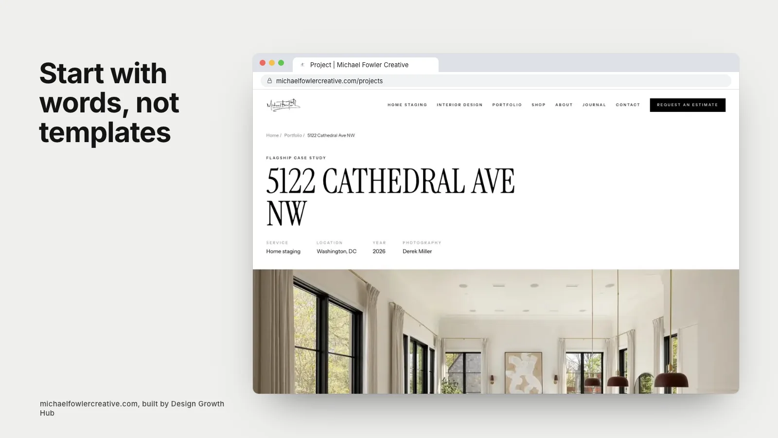
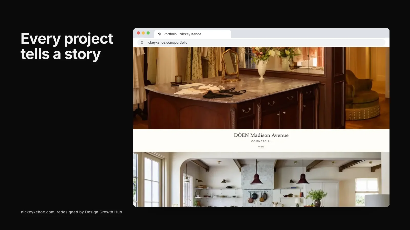
Project pages are where most studios leave the most value on the table. A gallery of twelve photos tells a visitor that you can style a room. A short written story tells them what problem you solved, for whom and how.
For each project, aim to include the location, the scope of work, the client's goal in a sentence or two, what you changed and anything notable about materials, collaborators or challenges. This is not about long essays. Three or four paragraphs and a handful of captions transform a gallery into evidence. It also gives Google and AI tools something to read, which matters more each year. Our piece on building an interior design portfolio website goes deeper on layout and order.
Write for clients first, search engines second
The words on your site should sound like you talking to a good client, not like a list of keywords. That said, clear language and good search visibility usually point in the same direction. If you design kitchens and baths for renovation clients in a particular county, say exactly that, in plain words, on the relevant pages.
Vague phrases like "curated spaces for modern living" feel elegant but tell no one what you do. A sentence such as "full-service interior design for whole-home renovations in the North Shore suburbs of Chicago" is clearer for a homeowner and far easier for search tools to understand.
Template, builder or custom website?
Many studios start on Squarespace, Showit or a theme. That is a reasonable first step. The limits appear when you want more service and location pages, faster loading with large photography, cleaner structure for search or a design that genuinely feels like your brand rather than everyone else's.
There is no single right answer. Our comparison of a website builder versus a designer lays out the trade-offs honestly, including when a builder is the smarter choice.
How Google and AI tools read your website
Search engines and AI assistants cannot look at a photo and understand that it shows a luxury kitchen remodel in a 1920s home. They rely on text: page titles, headings, descriptions, project write-ups, image alt text and structured data. A site with beautiful images and almost no words is close to invisible to them.
This is why we pair design with visibility work. A clear page structure, descriptive titles, accurate business details and project pages with real context make your studio easier for Google search and AI tools to understand. Nobody can promise a ranking or a mention, but a readable site gives you a fair chance.
Making the inquiry easy
Your contact page should not feel like a job application. Ask for what you genuinely need to reply well: name, email, website or project location, what they are looking for and an optional budget range. Tell them what happens next and when. Then make sure every service and project page has a calm, visible way to reach that form.
If you sell products or offer e-design, that changes the structure, and our article on whether an interior design website should sell products online covers when it makes sense.
What a strong studio website looks like in practice
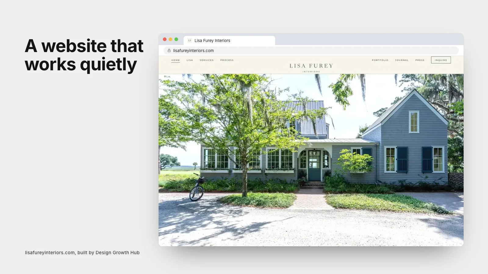
Lisa Furey Interiors in Bluffton is a good example of the difference structure makes. Her previous Squarespace site showed beautiful work but said little about her services, her projects or her years of published features. The rebuild added ten project stories, a press archive and clear service pages. You can see how it came together in the Lisa Furey Interiors case study.
When you are ready to look at your own site with fresh eyes, request a studio review and we will email you a recommended next step.
Make your studio easier to find
When the right clients search, clarity is what brings them to you. Let us look at the structure behind how you are found.
Request a Studio Review