Searching for interior design website examples usually leads to lists of beautiful homepages. They are inspiring, but they rarely explain why a site works, and copying a look from another studio tends to make yours feel borrowed.
A more useful approach is to study examples for their structure: how they present projects, explain services, prove credibility and lead to an inquiry. Below are real patterns from studio websites we have designed and built, and what each one teaches.
The portfolio-led studio site
Some studios are best represented by their work first. Lisa Furey Interiors in Bluffton, South Carolina, leads with a single strong photograph, then moves straight to press logos, services and selected projects. Each project has its own page with a short story, facts about the home and a long gallery.
The lesson is that a portfolio-led site still needs words. The project stories are what turn beautiful photos into proof. You can see the full structure in the Lisa Furey Interiors case study.
The firm with decades of published work
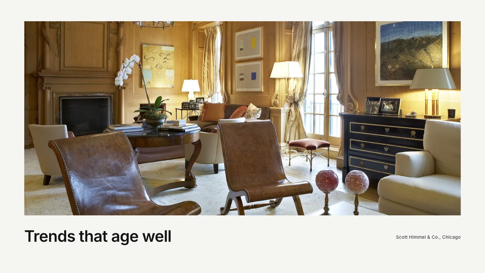
Scott Himmel & Co. in Chicago has been published in Architectural Digest, Veranda and Luxe, among others. The challenge on a site like this is giving that history room without turning the website into a list. The rebuild gave every one of 24 projects its own page and moved the publications and honors into a calm, readable About page.
The lesson: if you have credibility, show it clearly, but let it support the work rather than compete with it. The approach is laid out in the Scott Himmel case study.
The studio and shop under one brand
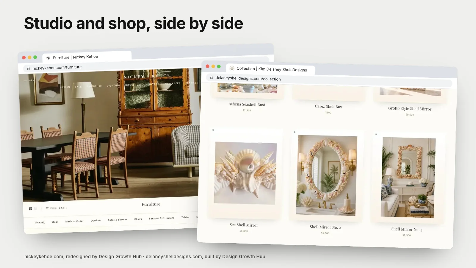
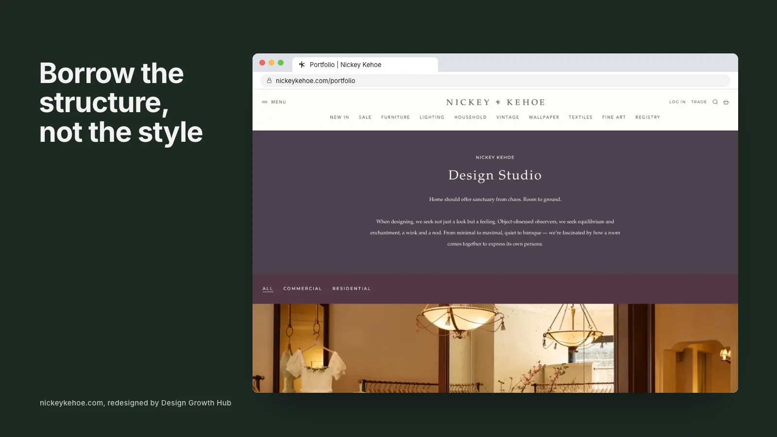
Some design businesses run a studio and a store together. Nickey Kehoe in Los Angeles and New York presents a design studio portfolio alongside a full furniture and vintage shop, with navigation that keeps the two clearly separate. Visitors who want a designer and visitors who want a sofa both find their way quickly.
If you are considering selling products, our article on whether an interior design website should sell products online covers when it helps and when it distracts.
The site built around a new identity
Martire Custom Homes needed a new monogram and a new domain as well as a website. The result is a 49-page site with portfolio stories, process, press and service-area pages for the communities the studio actually serves. It shows how service and location pages can sit naturally alongside a portfolio rather than feeling bolted on.
The decorative specialist
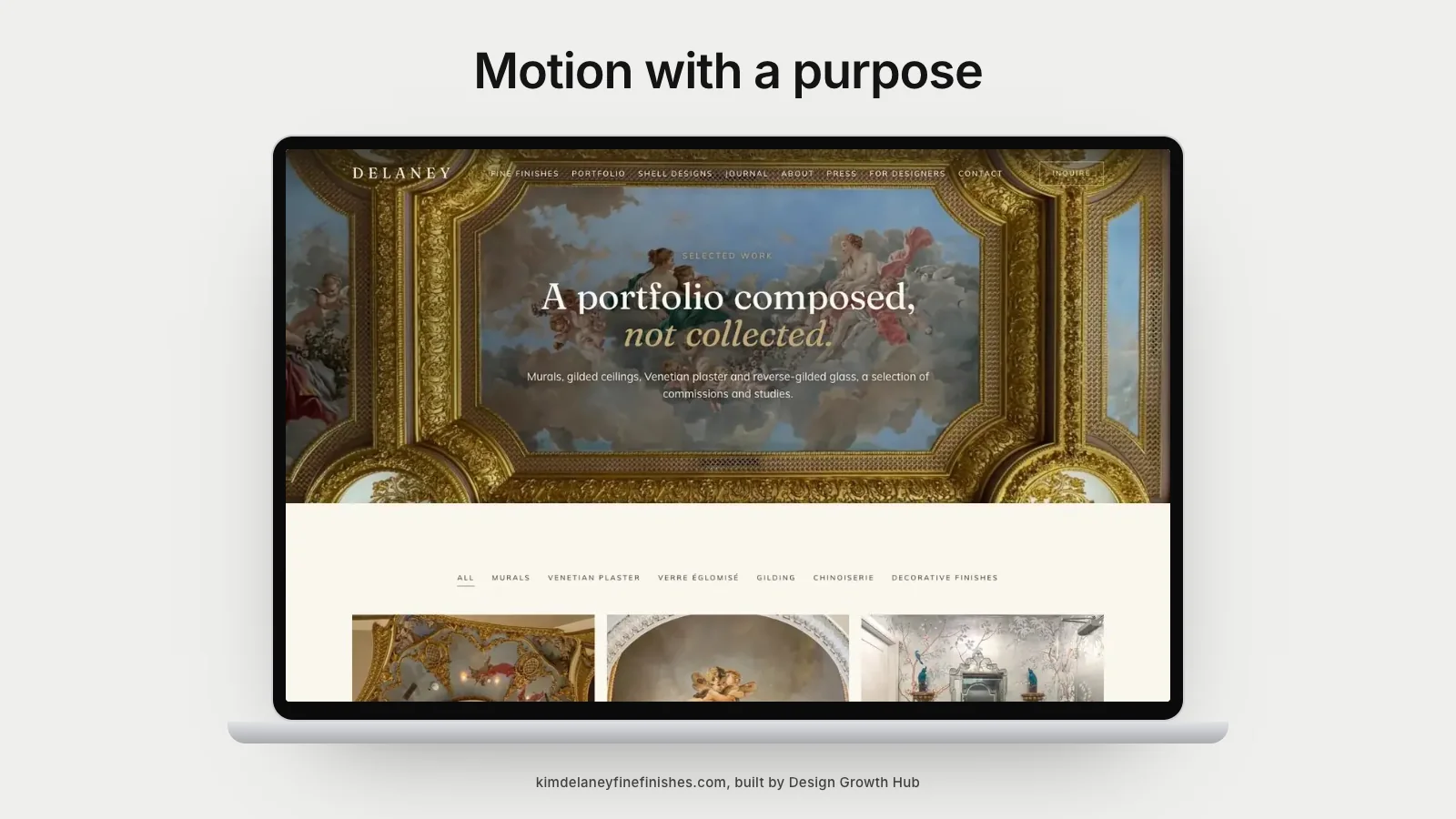
Not every design business is a full-service studio. Delaney Fine Finishes, a decorative painter in Florida, needed a site that explained each discipline, from frescos to gilding, and spoke to designers and architects as well as homeowners. Separate pages for each discipline and a page written for trade partners did that job.
The firm with hundreds of projects
Michael Fowler Creative in Washington, DC, works across home staging and interior design, which means a very large archive. The challenge was showing more than 290 projects without overwhelming anyone. The answer was a filterable portfolio, one flagship case study told in depth and a journal for ongoing updates, alongside a small shop.
The lesson for busy studios is that volume is not the same as proof. A deep story about one representative project often persuades more than the full archive, and filters let people who want to browse do so on their own terms.
The studio that needed to be found locally
Sometimes the right example is not a rebuild at all. Dwelling Design Interiors in Wenatchee, Washington, already had a website. What it needed was to be easier to find. The work focused on visibility and three search-focused service pages written for the existing site, covering design services, new construction and remodel consulting.
The lesson is that a strong website is sometimes a matter of adding the right pages rather than starting again.
What to take from any example
When you look at another studio's website, ask these questions rather than noting colors and fonts:
- How quickly does the site tell you what the studio does and where?
- Does each project explain the work, or only show it?
- Are services separated into their own pages?
- Where does credibility appear, and does it feel natural?
- How many steps does it take to reach the contact form on a phone?
These answers are transferable. A palette or typeface is not, and borrowing it usually makes a site look less like you.
How trends fit in
Website design trends come and go, from oversized type to subtle motion. Some are worth using and some age quickly. Our piece on interior design website design trends separates the two, and our article on animated interior design websites looks at when motion helps.
Turning examples into your own site
Once you know which patterns fit your business, the next step is to plan your pages and content in that order. Our guide to creating an interior design website step by step walks through it, and what an interior design company website should include gives a checklist of essential pages.
If you would rather have a team that has built these sites look at yours, request a studio review. We will tell you which of these patterns fits your studio and what to change first.
Strengthen your Google + AI visibility
The studios that get found are not always the best. They are the clearest. Let us make yours easier to understand and recommend.
Request a Studio Review