The website design trends worth following for interior design studios are the ones that make sites clearer and more pleasant to use: editorial layouts, generous photography, larger and more readable type, restrained motion, deeper project storytelling and structure that search engines and AI tools can read. Trends that rely on novelty, such as heavy animation or hidden navigation, tend to date within a year or two.
Here is a closer look at what is working now, what to approach carefully and how to adopt trends without making your site feel like everyone else's.
Editorial layouts
More studio websites now read like magazine features. Projects open with a full-width image, followed by a short introduction, a pull quote or detail shot and paragraphs of story between groups of images. This pacing gives photography room and makes each project feel considered.
It is a trend worth following because it serves a real purpose: it helps visitors understand the work rather than skim a grid. It also naturally adds written context, which helps search. See our collection of interior design website examples for this pattern in practice.
Larger, more readable typography
Type has grown bolder and larger across well-designed sites. Big, confident headings and comfortable body text at generous sizes have replaced tiny, wide-spaced captions. Many studios are moving away from thin, decorative fonts that look elegant in a mockup but are hard to read on a phone.
This trend is likely to last because readability never goes out of style. If your site uses small, light text, increasing size and contrast is one of the simplest upgrades available.
Honest, restrained motion
Motion is everywhere, but the version that ages well is subtle: images that fade in as you scroll, smooth transitions between pages, gentle hover states. These details make a site feel crafted. The motion that ages badly is heavy and slow: long intro animations, text that flies in from every direction and effects that hold visitors hostage before they can read. Our article on whether animated websites help or hurt explores the line between them.
Real people and process
Clients increasingly want to see who they would be working with. Strong studio sites now include candid portraits, short descriptions of how the team works and glimpses of process: sketches, material boards, site visits. It is a welcome shift from anonymous galleries, and it builds trust in a way a polished room alone cannot.
Deeper project storytelling
The most effective trend for winning clients is not visual at all. Studios are writing more about their projects: the brief, the constraints, the decisions and the result. Case study style pages, with project facts and captions, help prospective clients picture working together. They also give AI tools something specific to cite. Our article on using case studies to win better clients explains the approach.
Calm color and natural textures
Color palettes on design websites have become warmer and quieter, often pairing deep neutrals with a single accent. Some sites use subtle texture or paper-like backgrounds. These choices work when they support photography. They become a problem when they lower text contrast or make every studio look alike. Our guide to choosing a website color palette offers a more personal approach.
Trends to approach carefully
- Hidden navigation on desktop: a hamburger menu on a large screen makes visitors work harder.
- Autoplay video heroes: they can be beautiful but often slow pages and drain mobile data.
- Horizontal scrolling galleries: they can feel novel but frustrate many visitors.
- Oversized cursor effects and custom cursors: fun briefly, distracting over time.
- Very low contrast text: stylish in screenshots, hard to read in daylight on a phone.
None of these is forbidden. They simply need a strong reason and careful execution.
AI-ready structure
The trend most studios have not caught up with is invisible. As more people ask ChatGPT, Gemini and Google's AI Overviews for designer recommendations, websites need clear written context: service pages, project descriptions, structured data and consistent business details. This is less a design trend than a shift in what a website needs to do. Our guide to making an interior design website AI-readable explains it in practical terms.
Social media trends are different
It is tempting to bring social media trends onto the website. Some translate well, like short process videos on project pages. Others, like fast-cut reels and trending audio, rarely suit a website. Our article on interior design social media trends worth your time covers the social side separately.
How to adopt trends without losing your identity
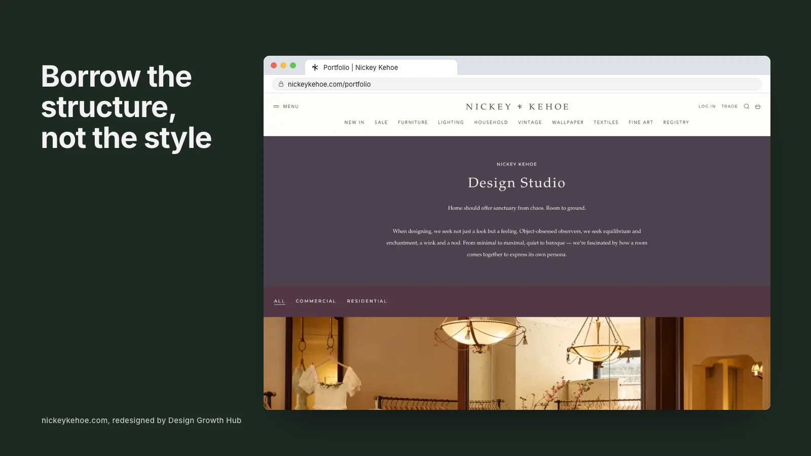
Start from your brand, not the trend. Ask whether a new approach makes your work clearer, your site easier to use or your story more compelling. If it does, adopt it in a way that fits your voice. If it only looks current, skip it. The websites that age best are built on timeless structure with a few well-chosen current details.
If you are planning a refresh, our website redesign service helps studios update thoughtfully, and our guides on creating a website step by step and what a company website should include cover the essentials. Or request a studio review and we will tell you which updates would make the biggest difference to your site. If you sell products, our article on interior design ecommerce websites covers shop trends too.
Strengthen your Google + AI visibility
The studios that get found are not always the best. They are the clearest. Let us make yours easier to understand and recommend.
Request a Studio Review