Interior design website best practices come down to a few habits: be clear about what you do, present projects consistently with real context, keep pages fast and readable, make the site accessible on every device, give search engines and AI tools enough written information and make inquiring easy. None of these is glamorous. Together, they separate websites that bring work from websites that only look good.
This guide gathers the practices that matter most, grouped so you can check your own site section by section.
Clarity and positioning
- State what you do, for whom and where within the first screen.
- Use the language clients use: "kitchen remodel", "new construction", "full-service design".
- Show the type of work you want more of first.
- Explain the areas you serve in plain place names.
- Keep one primary call to action, worded consistently.
Clear positioning is the foundation of everything else. If visitors cannot quickly tell what you do, no amount of beautiful design will help. Our guide to interior designer website design explains how positioning shapes the whole site.
Projects and portfolio
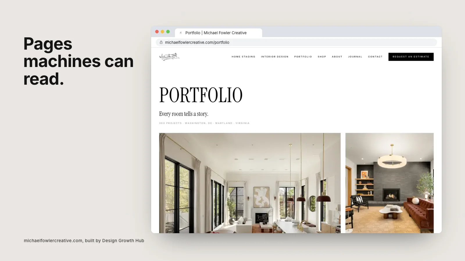
- Give each significant project its own page.
- Use the same layout for every project so visitors learn how to read them.
- Add a short story, project facts and captions to each.
- Organize projects by type or location as the portfolio grows.
- Credit collaborators and note publications where relevant.
These practices make your portfolio persuasive and readable by machines. Our guide to building an interior design portfolio website goes deeper.
Typography, color and layout
Design best practices for studios are mostly about restraint. Use one or two type families at comfortable sizes, with enough contrast against the background to read easily. Keep colors calm so photography leads. Leave generous space around text and images. Use consistent image ratios on each page.
Avoid light gray text on white, tiny captions and decorative fonts for body copy. They may look refined in a mockup and become hard to read on a real screen.
Speed and images
- Resize images to the largest size they will display, not the original camera file.
- Compress them and use modern formats where possible.
- Load images below the first screen only as the visitor scrolls.
- Avoid autoplaying video on the home page unless it is very light.
- Test on a phone using mobile data, not just office Wi-Fi.
Fast pages feel more polished, and speed affects how search engines judge your site. Our article on page speed and SEO explains the connection.
Mobile experience
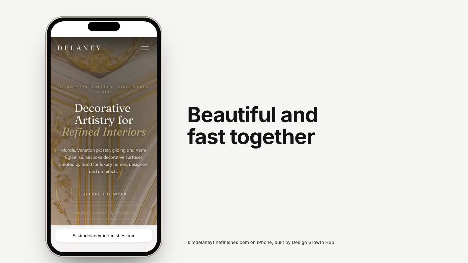
Most first visits happen on phones. Check every important page on a small screen: is the text readable without zooming, can buttons be tapped easily, do galleries scroll smoothly and is the contact page easy to reach? Fix anything that feels awkward. A site that is merely acceptable on mobile is losing people.
Accessibility
Accessible websites work better for everyone. Add descriptive alt text to images. Make sure text has enough contrast. Use real headings in order rather than styling paragraphs to look like headings. Make links and buttons clear and keyboard friendly. Avoid relying on color alone to convey meaning. These steps also help search engines understand your pages.
Search and AI visibility
- Write a unique, descriptive title and description for each page.
- Use clear headings that describe what follows.
- Keep your business name, address and phone identical everywhere.
- Add structured data describing your business and projects.
- Use clean, readable page addresses.
- Link related pages to each other naturally.
These are the practices that help Google and AI tools understand and recommend your studio. Our guide to making an interior design website AI-readable covers them in detail.
Motion and interaction
Subtle interaction can make a site feel crafted: gentle image fades, smooth transitions between pages, hover states that respond quietly. Use motion to guide attention, not to decorate. If an animation delays reading or slows loading, remove it. Our article on animated interior design websites weighs the trade-offs.
Inquiries and follow-up
- Keep the contact form short and friendly.
- Explain what happens after someone submits it.
- Confirm submissions with a clear thank you message.
- Reply quickly and consistently.
- Track where inquiries come from.
Maintenance
Best practice is not a one-time project. Add new projects as they are photographed, update press when features run, review service pages each year and check for broken links and slow pages a few times a year. A site that is gently maintained always feels more trustworthy than one redesigned every few years and then left alone.
Special cases
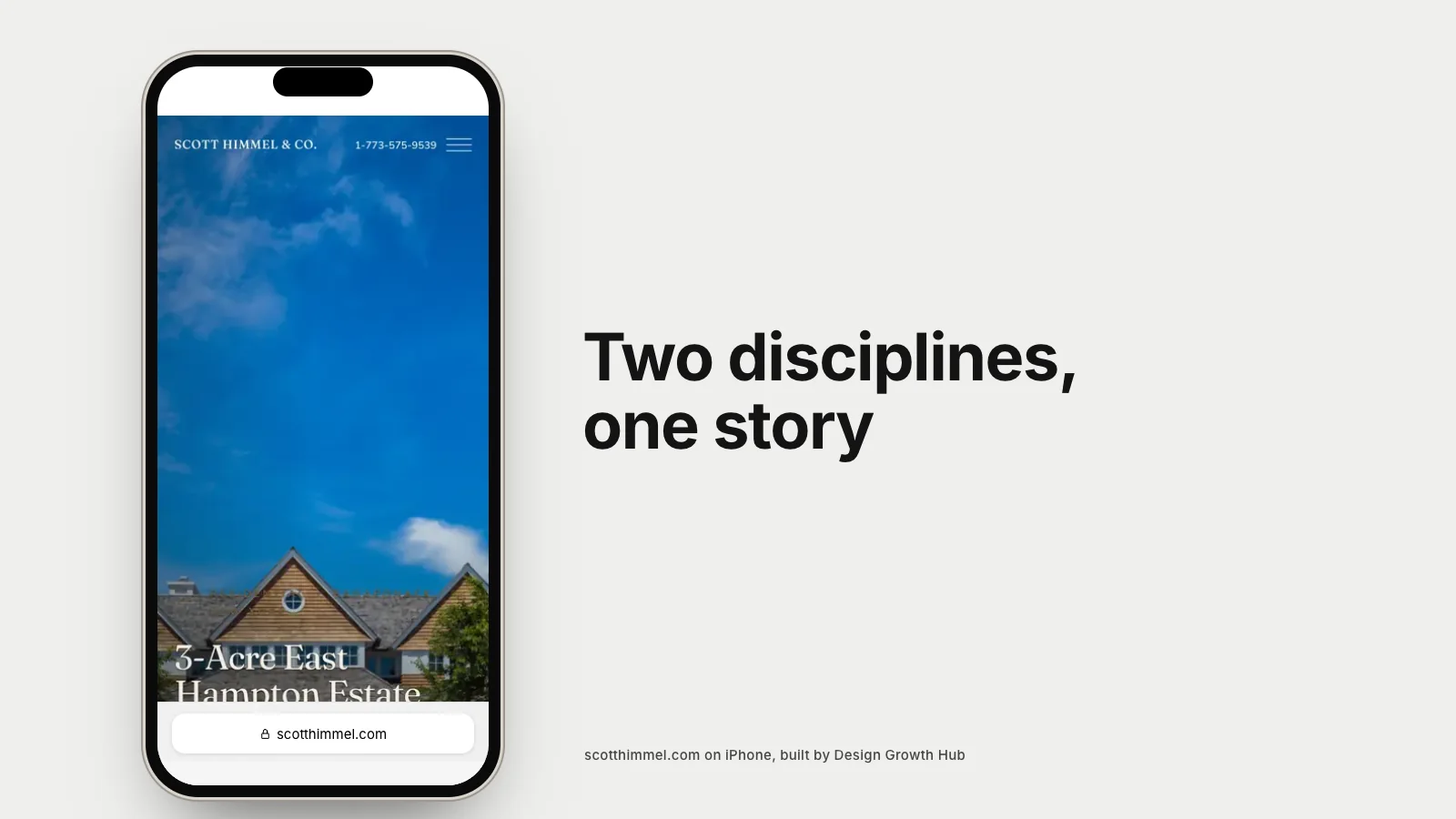
Some studios have particular needs. Practices that combine architecture and interiors need to present both disciplines clearly, as covered in our article on one website for an architecture and interior design practice. Studios that sell products need to balance the shop and the portfolio, discussed in whether an interior design website should sell products online. And every studio benefits from the checklist in what an interior design company website should include.
If you would like your site checked against these practices, our website redesign team can do it as part of a review. Or request a studio review to start. And if you are building from scratch, follow our guide to creating an interior design website step by step.
Request a Studio Review
If your work is already strong, the next step is making sure Google + AI can understand it clearly.
Request a Studio Review