A furniture website home page should tell shoppers what you sell and why they should choose you, inspire them with styled rooms, give clear paths into categories and collections, highlight new arrivals, show showroom details and services, display reviews and load quickly on phones. Shoppers decide within seconds whether to keep browsing, so clarity and inspiration need to work together.
Here are the sections that belong on a furniture home page, in a typical order.
A clear promise at the top
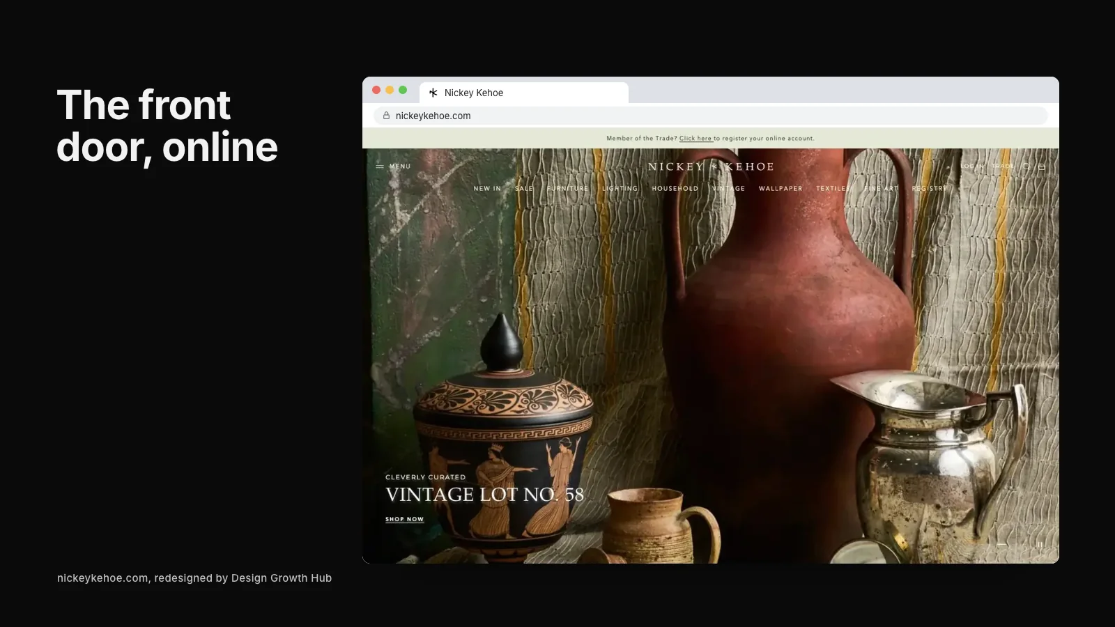
The opening screen should combine a strong room image with a short line about what makes your store distinctive.
Examples: "Handmade furniture from American workshops, delivered to your door." or "Modern and vintage furniture, styled in our Austin showroom."
Add a clear path to shop or visit, such as "Shop living room" and "Visit the showroom."
Paths into categories
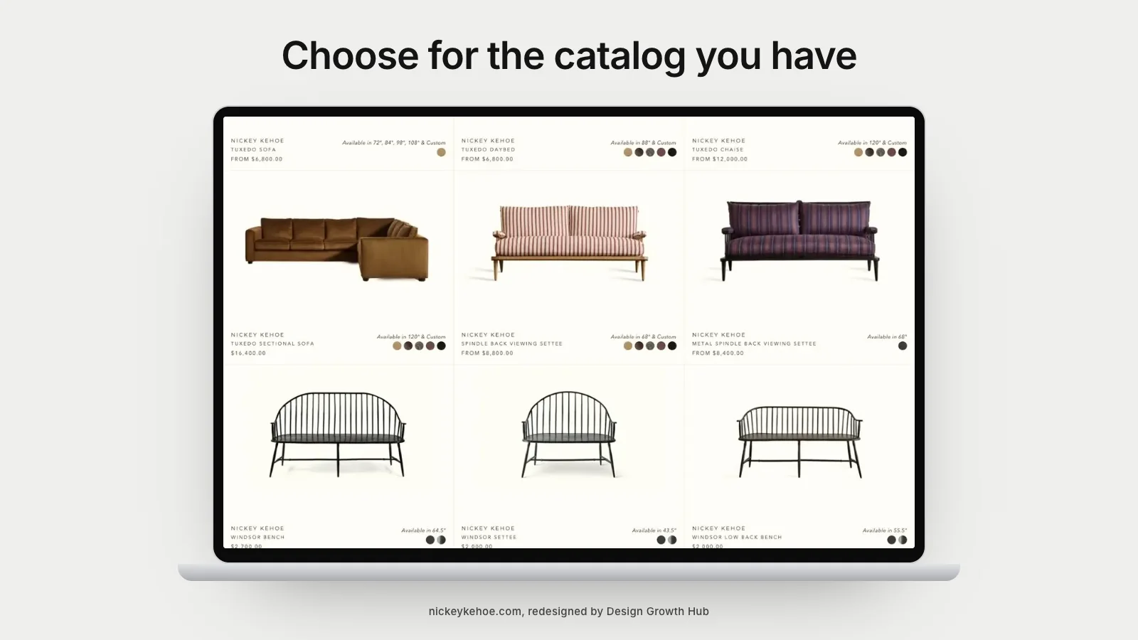
Show major categories as image tiles: living, dining, bedroom, outdoor, lighting, rugs. Shoppers often know which room they are furnishing and want to start there.
Featured collections or rooms
Highlight a few styled rooms or collections, each linking to the products shown. This turns inspiration into browsing.
New arrivals
A section for new arrivals gives returning visitors reasons to come back and shows the store is active.
Bestsellers or favorites
Popular pieces reassure new shoppers that others have chosen them. Pair with ratings where available.
Showroom details
For stores with showrooms, include the address, hours and a short invitation to visit, with a photo of the space. Many visitors use the website to plan a trip.
Services
Highlight services that set you apart: delivery and assembly, design help, fabric swatches, custom orders, trade programs. Brief, clear statements work best.
Reviews and proof
Short reviews, press mentions and customer photos build trust. Place them near product sections where shoppers form opinions.
Brand story
A short paragraph about who you are, linking to an about page, gives shoppers a sense of the people behind the store. Our article on why your about page matters for visibility explains why this helps search and AI tools as well.
Email sign-up
Invite visitors to join your list for new arrivals and events. Keep the sign-up simple and avoid aggressive pop-ups that block the page.
Footer
Include contact details, showroom information, delivery and returns links, trade program, social links and key categories. Keep business details consistent with your Google profile.
Speed and images
Furniture home pages are often image-heavy and slow. Compress images, use modern formats, load lower sections as visitors scroll and test on phones. Our article on page speed and SEO for image-heavy websites explains why speed matters.
Mobile layout
Most shoppers browse on phones. Make sure category tiles are easy to tap, text is readable and the opening image crops well on small screens.
What to leave off
- Endless sliders that rotate before anyone can read them.
- Pop-ups that appear immediately.
- Too many competing promotions.
- Long blocks of text.
Learning from design studios
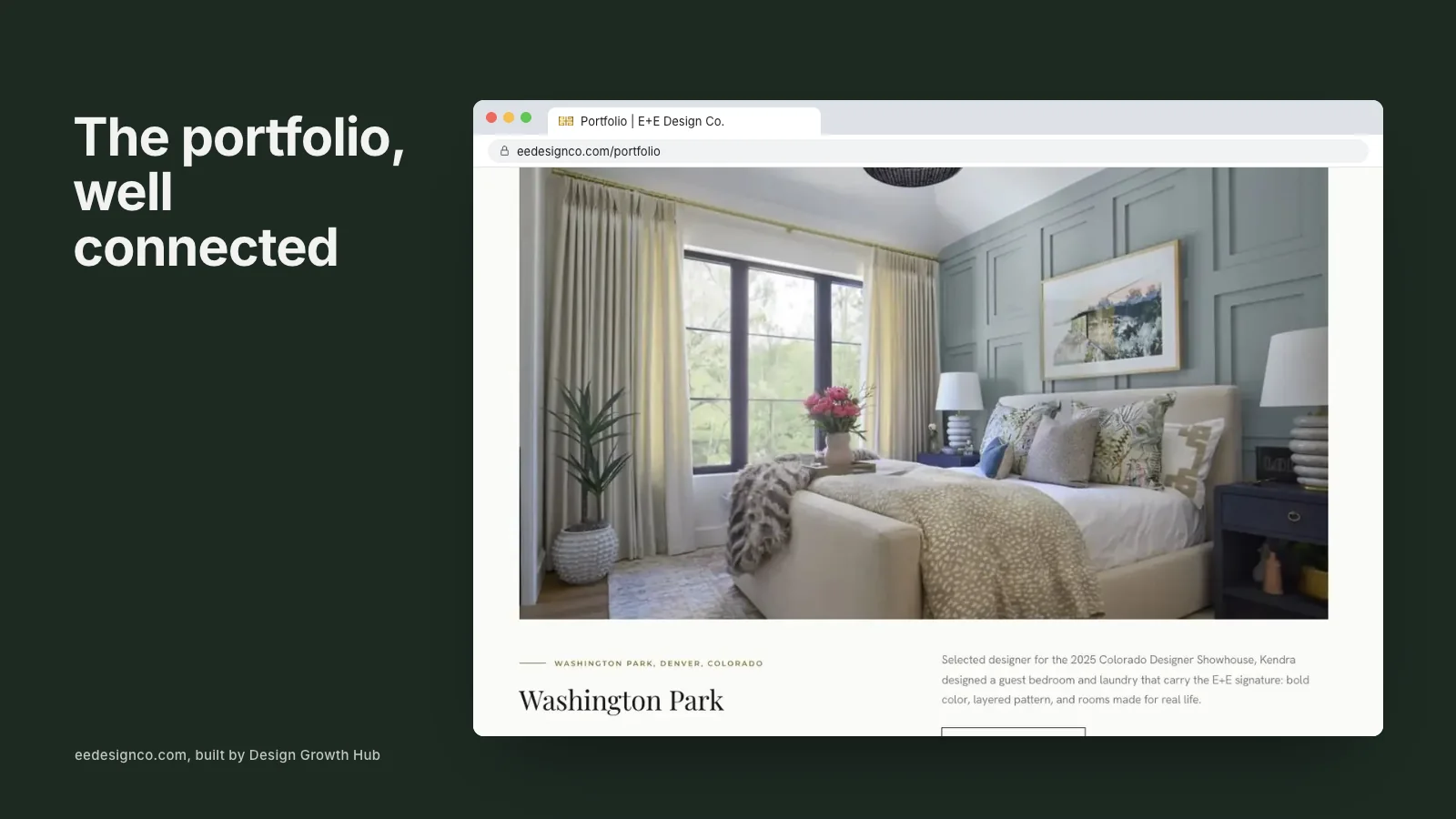
Interior design studios face similar choices about presenting work and inspiring visitors. Our article on what to put on an interior design website home page offers ideas that translate well.
Fitting into the wider site
The home page leads into category, collection and product pages. Our guides to website design for furniture stores, building a furniture ecommerce website and the best website builder for furniture stores cover the rest of the site.
Seasonal updates
A home page that never changes feels static. Update the opening image and featured collections with the seasons: outdoor furniture in spring, dining and entertaining before the holidays, bedroom refreshes in the new year. Seasonal updates give returning visitors something new and help shoppers find what is relevant now.
Telling shoppers what happens next
Shoppers considering a large purchase want to know what to expect. A short section on the home page explaining delivery, assembly, returns and how to get design help removes doubt early. Link to fuller policy pages for those who want detail.
Making the store feel personal
Independent furniture stores have an advantage over large retailers: people. A photo of the owner or design team with a short welcome message makes the store feel human and approachable. Shoppers who feel they know someone at the store are more likely to visit or reach out with questions.
Search on the home page
For stores with large catalogs, a visible search bar near the top of the home page helps shoppers who know what they want. Make sure search results are useful, with filters and clear product images. Poor search sends shoppers away.
Accessibility
Use readable text sizes, sufficient color contrast and descriptive alt text on images. Accessible home pages work better for everyone and help search engines understand your content.
Linking to inspiration content
If you publish styling guides or room inspiration articles, feature one or two on the home page. Helpful content keeps visitors exploring and builds confidence in your expertise.
Testing and improving
Watch which sections shoppers click and where they leave. Try different opening images or category orders and see what increases browsing and sales. Small changes can make a measurable difference.
If you would like help designing a furniture home page that inspires and converts, our website redesign service works with design retailers. Or request a studio review to start.
Request a Studio Review
If your work is already strong, the next step is making sure Google + AI can understand it clearly.
Request a Studio Review