The architecture website design ideas worth using are the ones that make the work clearer: editorial project pages that pace photography like a magazine, drawings and sketches used as design elements, honest typography at confident sizes, calm motion that guides attention, process stories that show how the firm thinks and a clear structure that helps visitors find what they need. Ideas that make a site louder rather than clearer, such as heavy effects and hidden navigation, tend to work against the work.
Here are ideas grouped by purpose, with notes on when each helps.
Editorial project pages
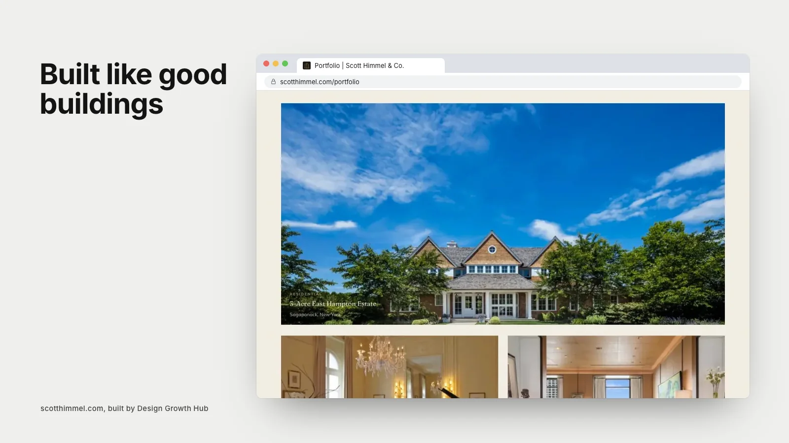
Treat each project like a magazine feature: a full-width opening image, a short introduction, project facts, then alternating images, drawings and paragraphs. Editorial pacing gives each project space and makes visitors slow down. It also creates room for the written context clients and search engines need.
Drawings as design elements
Plans, sections and sketches are beautiful in their own right. Use them as visual elements across the site: a section drawing as a hero on a project page, sketches beside narrative text, a plan that reveals as you scroll. Drawings distinguish architecture websites from interior design or builder sites and show thinking that photographs cannot.
Confident typography
Architecture websites benefit from clear, confident type: large headings, readable body text and restrained use of capitals and letter spacing. Avoid tiny, light gray text that looks refined in a mockup but is hard to read. One or two type families are enough.
A restrained palette
Most architecture sites let photography lead with a neutral palette. A single accent, drawn from the firm's identity, can mark links or labels. Consistency across pages makes the site feel considered.
Calm, purposeful motion
Subtle motion can make a site feel crafted: images that fade in as they load, smooth page transitions, a project index that responds gently on hover. Avoid long intro animations and effects that delay seeing the work. Respect visitors who prefer reduced motion. Our article on animated websites discusses the balance in a related field.
Project index views
Offer more than one way to browse: a visual grid, a list view with project facts and filters by type or location. List views appeal to clients and peers who want to scan quickly.
Process stories
Show how the firm works through process content: site analysis, models, material studies, construction photos. A dedicated process page or process sections within projects help clients understand the journey.
People and studio culture
Photos of the team at work, the studio space and model shop make the practice feel human. Short profiles of principals and project leaders help clients understand who they will work with.
Maps and location
For firms working across a region, a map of projects can show reach and local experience. Keep it simple and fast.
Clear navigation
Keep the menu short and labels plain: Work, Practice, People, News, Contact. Make contact visible on every page. On large screens, avoid hiding navigation behind a menu icon.
Clear structure underneath
Good structure is invisible but essential: logical page hierarchy, descriptive titles and headings, clean addresses and internal links between projects, services and people. Our article on what website architecture means explains why structure matters.
Ideas for small and solo practices
Freelance and solo architects can adopt many of these ideas in a simpler form: a focused portfolio, a personal about page and a clear contact path. Our article on website design for freelance architects offers a lighter plan.
Ideas for combined practices
Firms offering architecture and interiors can use parallel project structures or integrated stories. Our article on one website for an architecture and interior design practice explores options.
Learning from examples
Our articles on architecture firm website examples, what great architecture firm websites have in common and architect website design that wins residential clients show these ideas in practice.
Writing as a design element
Short, well-written statements can be as striking as images: a single sentence about the practice's approach set in large type, a quote from a client, a brief note on a material. Used sparingly, words give rhythm to pages and help visitors understand the thinking behind the work. They also give search engines and AI tools the context that images alone cannot provide.
News and publications
A simple news or publications section, updated when projects are published, awarded or exhibited, keeps the site current and shows an active practice. Link to external features where possible and keep each entry brief.
Careers as culture
A careers page with real information about how the studio works, its values and current openings supports recruiting and also tells clients something about the culture they will be working with.
Accessibility as good design
Readable contrast, descriptive alt text and keyboard-friendly navigation are part of good design, not extras. They make the site work for everyone.
Ideas to approach carefully
- Horizontal scrolling that frustrates many visitors.
- Hidden navigation on desktop.
- Autoplay video that slows pages.
- Experimental cursors and effects.
- Very low contrast text.
Testing ideas
Before committing to an idea, test it on a phone and with someone outside the profession. If they can understand the work and find the contact page quickly, the idea is serving its purpose.
If you would like help applying these ideas to your practice's website, our website redesign service works with architects. Or request a studio review to start.
Fix the structure behind your website
Beauty gets attention. Structure gets discovery. We help you build both, so the right clients arrive ready.
Request a Studio Review