Great architecture firm websites share a handful of qualities. They state clearly what kind of work the firm does and for whom. They present projects as stories, with photography, drawings, facts and the thinking behind the design. They introduce the people who will lead a project, explain how the firm works, present recognition calmly and make it easy for prospective clients to take the next step. Underneath, they are well structured, fast and readable, which helps both clients and search engines understand the firm.
Here is a closer look at each quality.
Clarity about the work
Architecture is broad. A firm focused on custom residences, one doing multifamily housing and one designing civic buildings need very different websites. The best sites say plainly what the firm does, where and for whom, often in a sentence near the top of the home page. Clarity attracts the right clients and helps search engines and AI tools understand the practice.
Projects told as stories
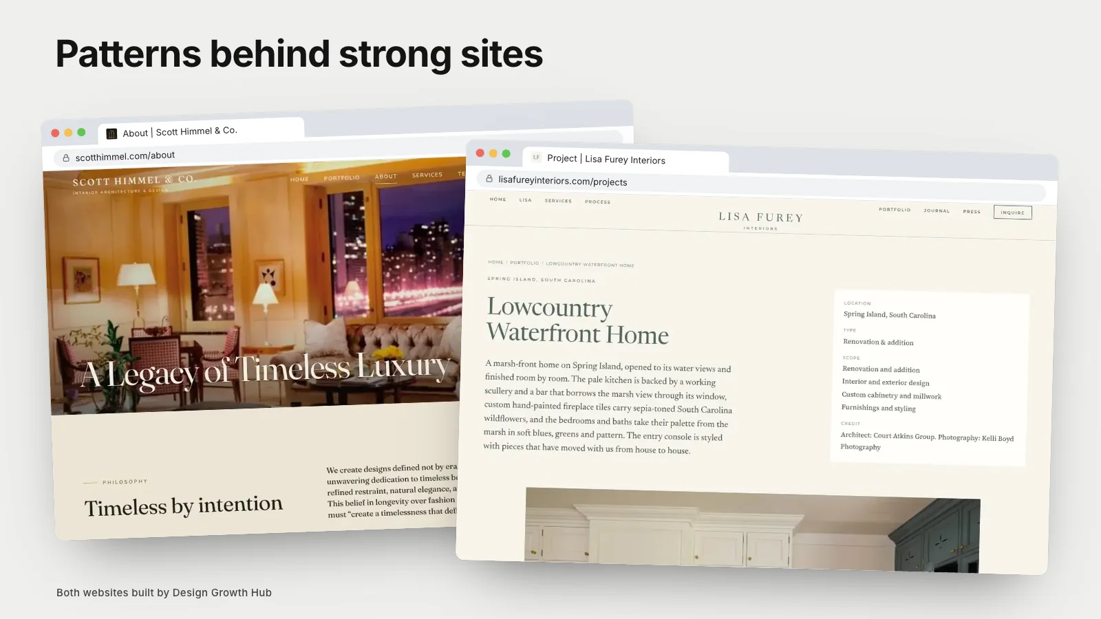
Architecture clients want to understand how a firm thinks. Strong project pages go beyond photography to include the brief, the site, constraints, design moves, materials, sustainability considerations and the outcome. Drawings, sketches and models show process. Project facts such as location, size, completion date and collaborators add credibility.
Our collection of architecture firm website examples looks at several approaches.
Photography with room to breathe
Architecture photography deserves generous space. The best sites use large, full-width images, consistent editing and a thoughtful sequence, often moving from context to building to interior to detail. They avoid cramming many small images into grids.
People and leadership
Clients hire people. Introduce principals and key team members with real photos, backgrounds and roles. Explain who will lead projects. For smaller firms, the founder's voice and perspective can be a strong part of the brand.
Process
Architecture projects are long and complex. Explaining how the firm works, from early conversations and site analysis to design phases, permitting and construction administration, reassures clients. A clear process page also helps clients understand fees and timelines.
Recognition, presented calmly
Awards, publications and exhibitions build credibility. The best sites present them in a dedicated section or on project pages without overwhelming the work. Links to published features add authority.
Readable structure
Good architecture websites are, fittingly, well organized. Clear navigation, logical page hierarchy, descriptive page titles and headings and fast-loading pages make the site easy to use. Our article on what website architecture means explains how structure supports both visitors and search engines.
Practices that combine disciplines
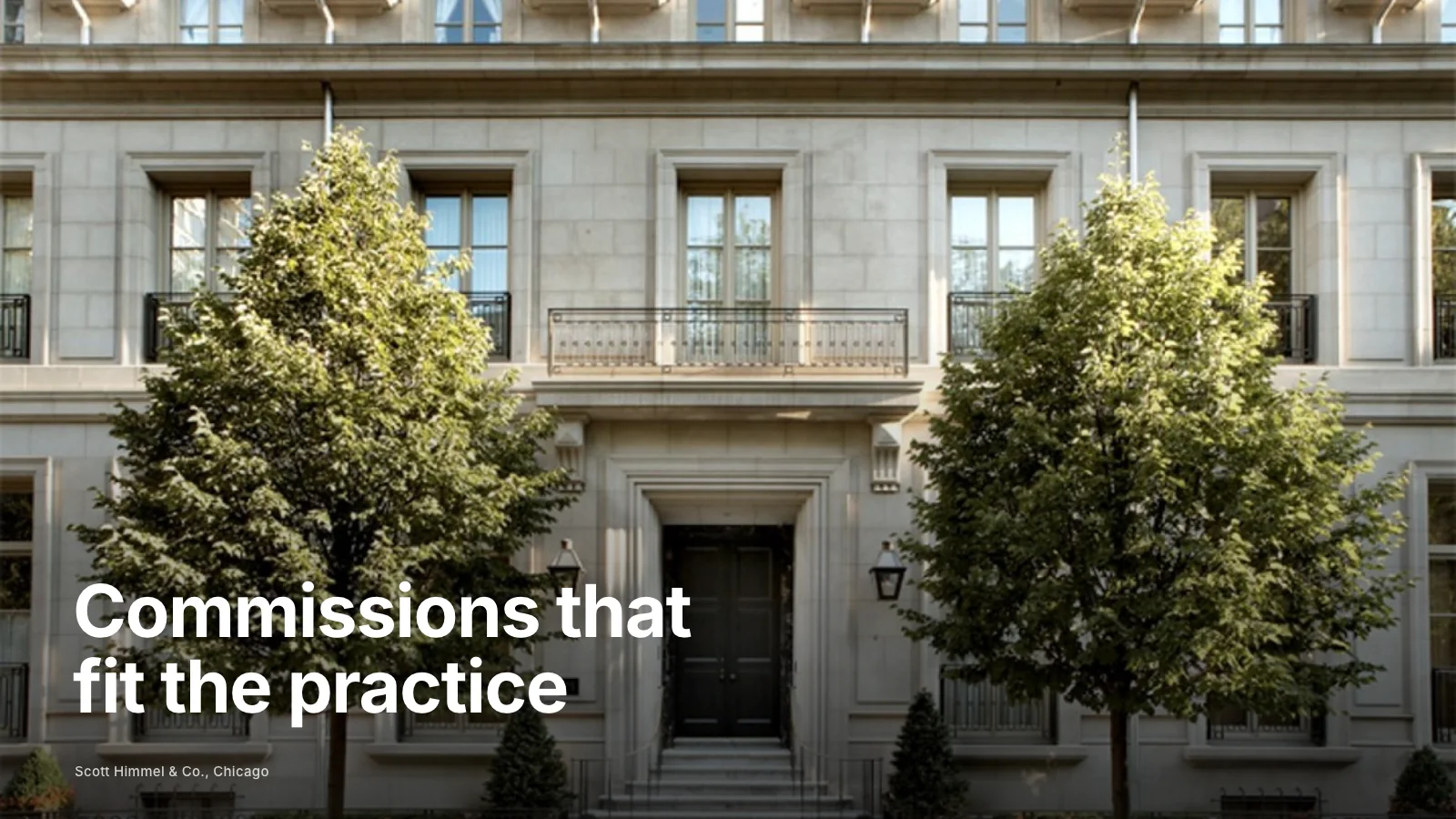
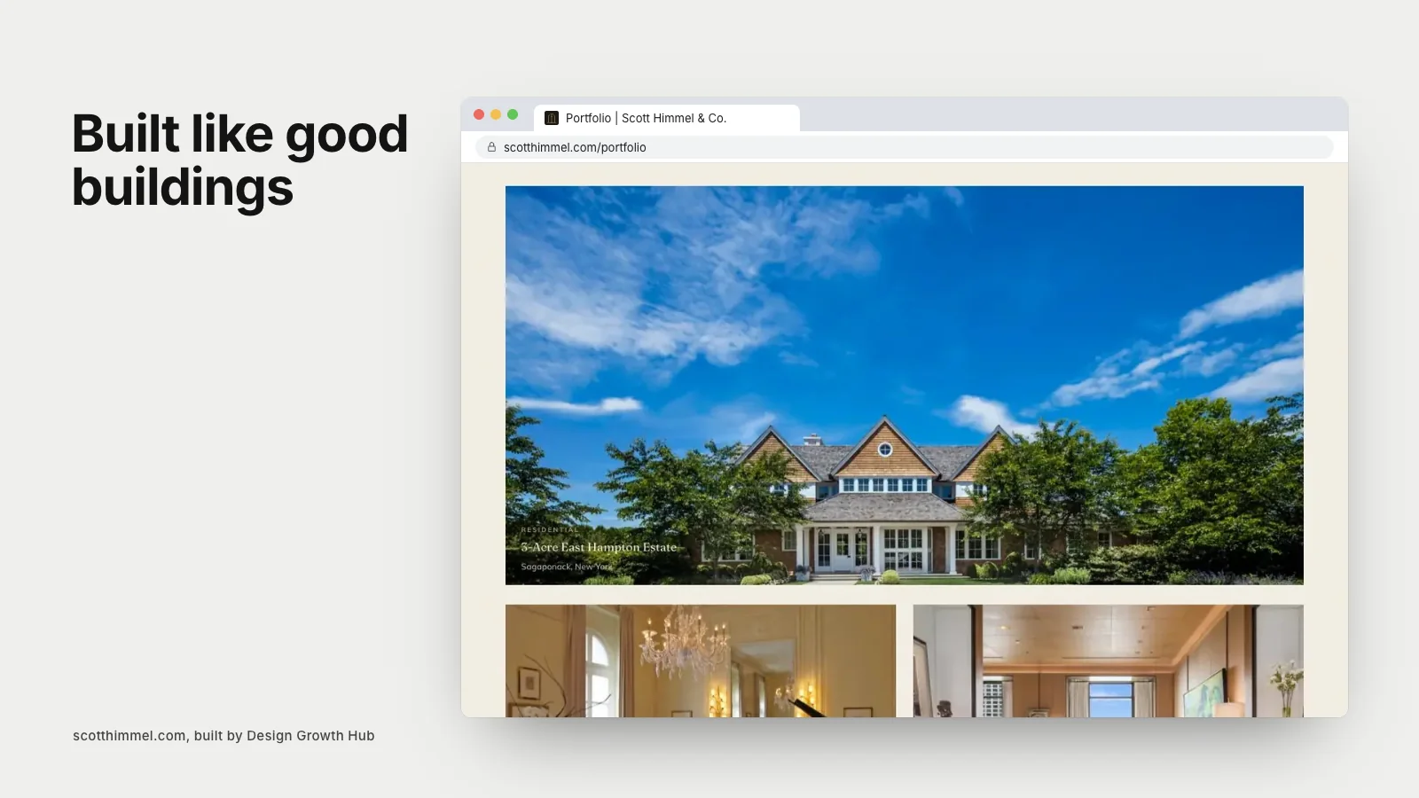
Some firms offer architecture and interior design together. Their websites need to present both clearly. Scott Himmel & Co. in Chicago, an architecture and interior design firm, has a website with 24 project pages, a filterable portfolio and an About page that brings decades of press and honors forward. You can see it in the Scott Himmel case study, and our article on one website for an architecture and interior design practice explores the approach.
Paths for different visitors
Architecture websites serve prospective clients, potential hires, collaborators and press. The best ones provide clear paths for each: project inquiries, careers, press contacts. Prospective clients should never have to hunt for how to start a conversation.
Search and AI visibility
Clients search for architects by project type and location: "residential architect in Boulder", "modern home architect near me". Service and project pages written in those terms help. AI tools increasingly summarize architecture firms when clients ask for recommendations, drawing on websites, profiles and publications.
Writing that sounds like the firm
Architecture writing can easily become abstract. The best websites explain ideas in clear, confident language that clients understand: how a house responds to its site, why a material was chosen, how light moves through a space. Specific explanations make the work memorable and show how the firm thinks without alienating clients who are not architects.
Mobile experience
Many prospective clients first see a firm's website on a phone, perhaps after a referral. Large images must load quickly, project pages must scroll smoothly and navigation must be easy to use with a thumb. Test the site on a phone regularly, especially portfolio pages with many images.
Keeping the portfolio current
A portfolio that ends several years ago suggests a quieter firm. Add projects as they are photographed, even with a short description at first. Update the team page when people join or leave, and refresh recognition as new publications or awards arrive. A current site signals an active, healthy practice.
Showing work in progress
Some firms share projects under construction or in design, with clients' permission. Work in progress shows that the firm is busy and gives visitors a sense of process. It also gives returning visitors something new to see between finished projects.
Common mistakes
- Beautiful images with no explanation of the work.
- Vague positioning that could describe any firm.
- Hidden contact information.
- Slow, heavy pages.
- Project pages without location, scope or collaborators.
Marketing beyond the website
A great website supports broader marketing. Our articles on architecture firm marketing for residential practices, writing an architecture firm marketing plan and choosing an architecture firm marketing agency explain how the website fits into a complete approach.
If you would like an architecture website that presents your work and thinking clearly, our website redesign service works with architects and design firms. Or request a studio review to start.
See how Google + AI understand your studio
A beautiful portfolio matters. But if search engines and AI tools cannot connect your studio to the right searches, better-fit clients may never reach your website.
Request a Studio Review