Images on an interior design website should be carefully selected, sequenced like a magazine story, sized and compressed for fast loading, and given descriptive file names, alt text and captions. Done well, photography sells your work while the written details help Google and AI tools understand what each photo shows.
Here is a practical guide to each step, from choosing images to the technical details most studios overlook.
Select fewer, stronger images
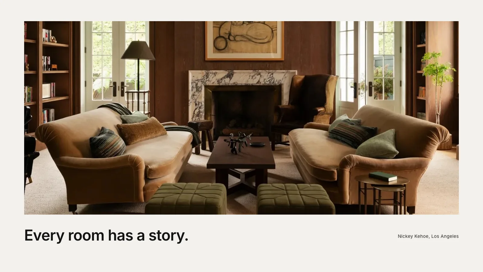
The instinct is to show everything. The better approach is to edit hard. For each project, choose the images that tell the story best: a few wide shots establishing the space, a handful of medium views and several details that reveal materials and craftsmanship. Leave out near-duplicates and weaker angles.
A tight selection keeps visitors engaged and makes each image feel important. It also keeps pages faster. If a project has forty good photos, twelve to twenty well-chosen ones usually tell the story better.
Sequence them like a story
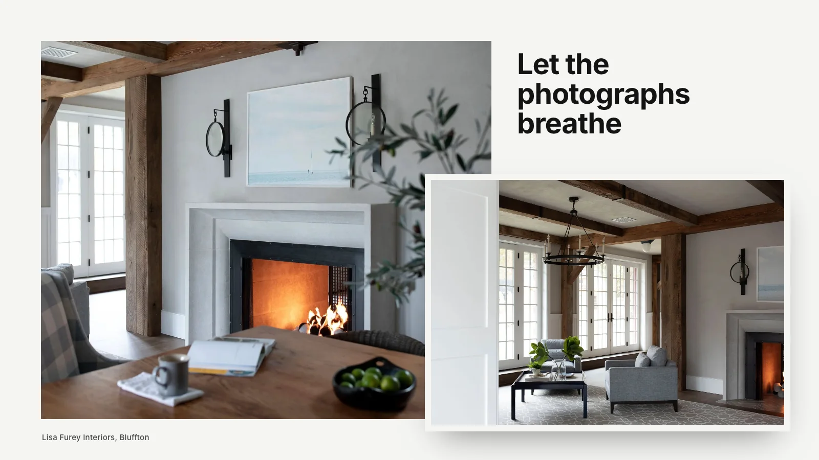
Order matters. A natural sequence might begin with the entry or a defining room, move through the main living spaces, pause on details and end with a memorable view. Mix wide and close images to create rhythm. Pair images side by side where they relate, such as a room and a detail within it.
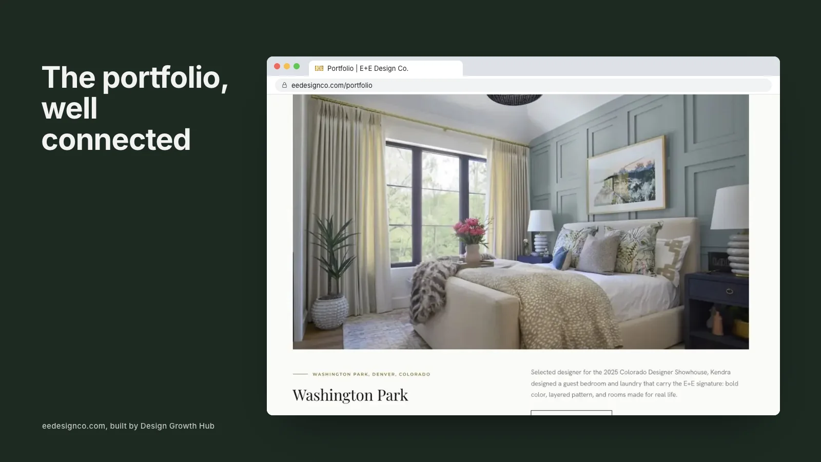
Magazines have perfected this pacing, and it translates beautifully to project pages. Our guide to why portfolio pages need more than photos shows how images and words work together.
Keep color and ratios consistent
Images shot by different photographers or in different seasons can look mismatched side by side. Ask your photographer for consistent editing, or work with a retoucher to bring older projects closer together. Within each page, keep image proportions consistent where possible, so the layout feels calm.
Size images correctly
Camera files are often several thousand pixels wide and many megabytes in size. Uploading them directly makes pages slow. Resize images to the largest size they will display. For a full-width image on a large screen, around 2,000 to 2,500 pixels wide is usually plenty. Smaller images within a grid need far less.
Many platforms create smaller versions automatically for phones. If yours does not, it is worth doing manually or asking your developer to set it up.
Compress and use modern formats
Compression reduces file size with little visible change. Modern formats such as WebP or AVIF are typically much smaller than JPEG at similar quality. Most current browsers support them. Combined with correct sizing, compression is the single biggest speed improvement for most design websites. Our article on page speed and SEO explains why speed affects visibility as well as experience.
Load images as visitors scroll
Images further down a page do not need to load immediately. Lazy loading tells the browser to fetch them as the visitor approaches. This makes the first screen appear faster. The one exception is your opening image, which should load right away because it is the first thing people see.
Name files descriptively
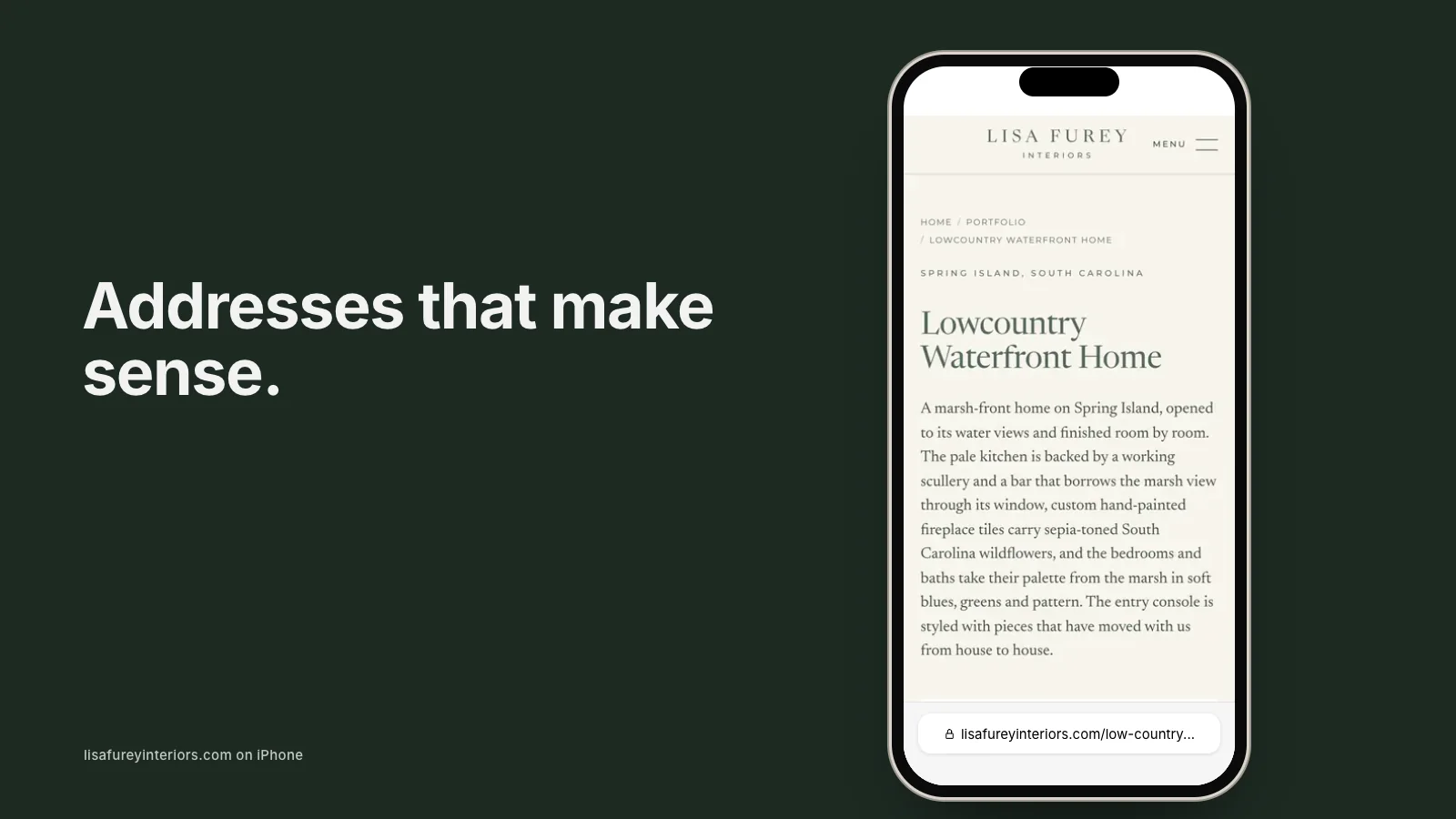
"IMG_4821.jpg" tells search engines nothing. A file name such as "lake-forest-kitchen-walnut-island.jpg" describes the image in a way people and machines understand. It is a small step, but across hundreds of images it adds meaningful context. Our article on website slugs and interior design SEO explains the same principle for page addresses.
Write alt text that describes the room
Alt text is a short description of an image used by screen readers and search engines. Describe what is visible and relevant: "Primary bathroom with marble walls and a freestanding tub under a window." Avoid stuffing keywords or writing "image of". Decorative images that add no meaning can have empty alt text.
Good alt text improves accessibility and helps Google and AI tools understand your work. Our guide to making an interior design website AI-readable covers it alongside other written signals.
Use captions to add meaning
Captions are often skipped, yet they add context that photos cannot: the room, a key material, a maker, a design decision. A caption like "Custom plaster hood by a local artisan" turns a pretty kitchen into a story of craftsmanship. Use them sparingly and consistently.
Choose the right opening image
The first image on your home page and each project page carries extra weight. Choose one that represents the work you want more of and reads well when cropped differently on a phone. Our guide to what to put on an interior design website home page discusses how the opening image works with your first line of text.
Credit and permissions
Always credit photographers as your agreement requires, and check usage rights before using images on your website, in ads or on social media. If a project is shared with an architect or builder, agree how each of you will use and credit the photography. These details protect relationships and build quiet credibility, as discussed in building trust before a client contacts you.
Where images fit in the bigger picture
Images work best inside a clear layout with real context around them. Our guide to the interior design website layout that leads to inquiries shows where they sit within each page. If your photography is strong but the site feels slow or the work is not reaching the right people, our website redesign service handles image optimization as part of every build. You can also request a studio review and we will look at your images alongside everything else. Starting from scratch? Our guide to creating an interior design website step by step covers photography planning early on.
Turn your website into a visibility asset
A website can be a brochure or an asset that brings clients. We help design studios build the second kind.
Request a Studio Review