The best interior design website layout follows the order of questions a prospective client asks: what do you do, is your work right for me, can I trust you and how do I start? When each page answers those questions in sequence, visitors move toward an inquiry naturally. When the order is muddled, even beautiful work fails to convert.
Below is a practical layout for the home page, project pages, service pages and navigation, along with the details that quietly make a difference.
The questions behind every layout
Think about a homeowner who has just been referred to you. They open your site on their phone during a lunch break. Within seconds they want to know whether you design homes like theirs. Within a minute they want to see proof. Within a few minutes, if they are interested, they want to know how to reach you and what happens next.
A layout that serves this visitor puts the clearest answer first and the details after. It is less about clever design and more about sequence.
A home page layout that works
Most strong studio home pages follow a similar order, adapted to each brand:
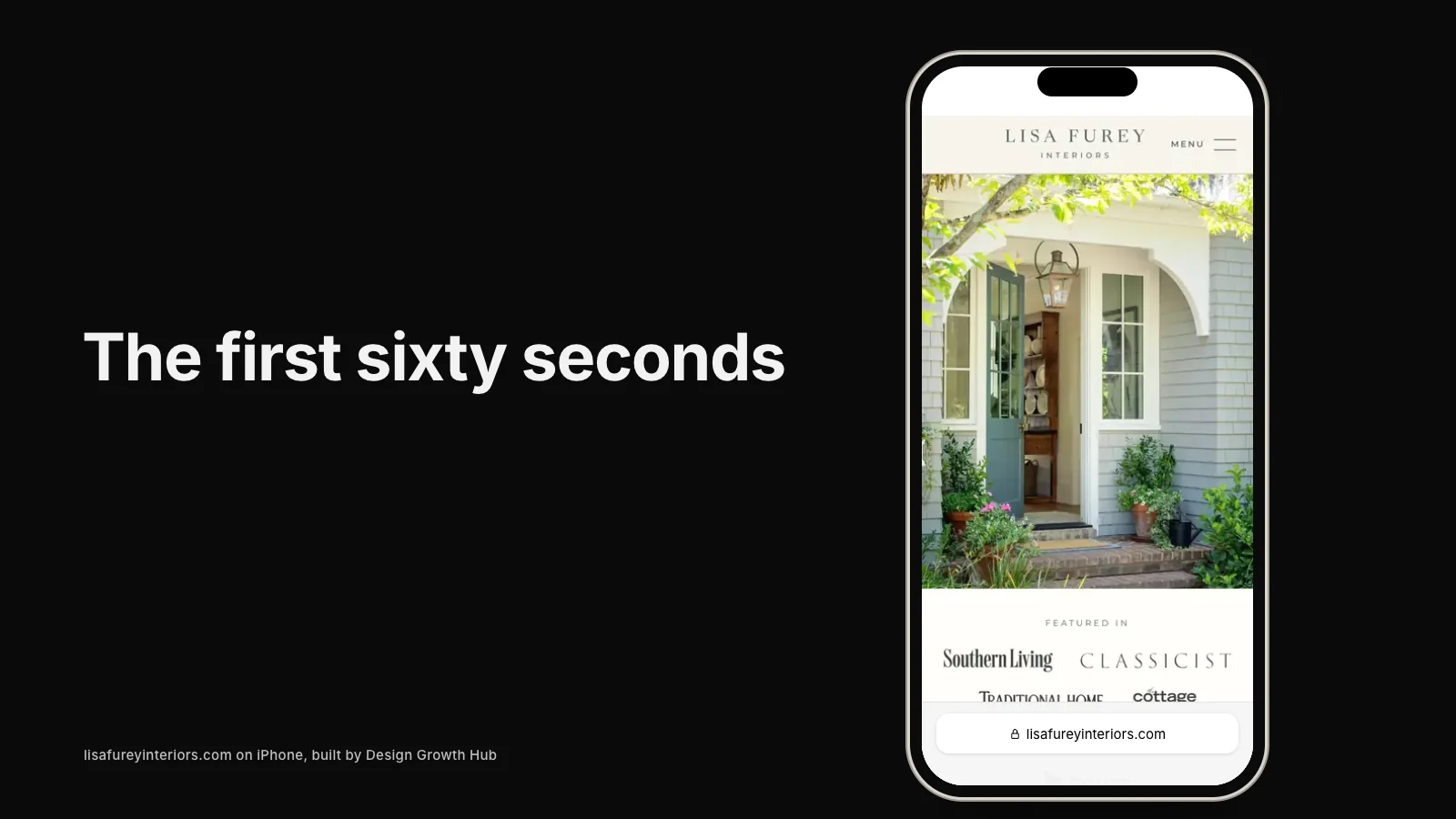
- Opening screen: a single strong image of the work you want more of, your name and one plain line about what you do and where.
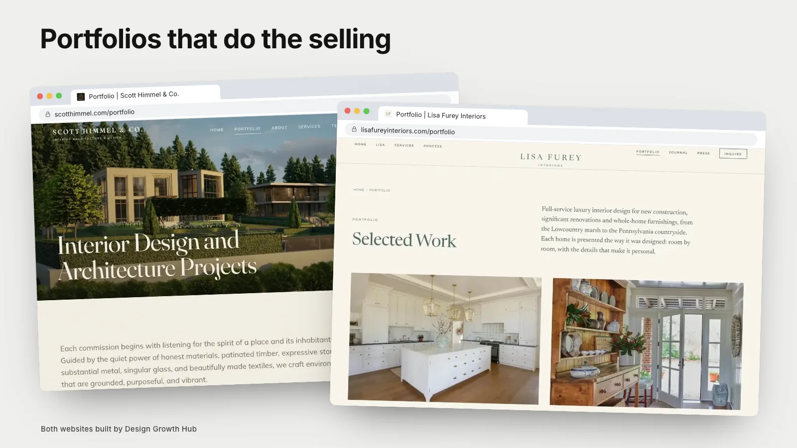
- Selected projects: three to six projects with clear titles, linking to full project pages.
- Services: a short summary of each core service, linking to its own page.
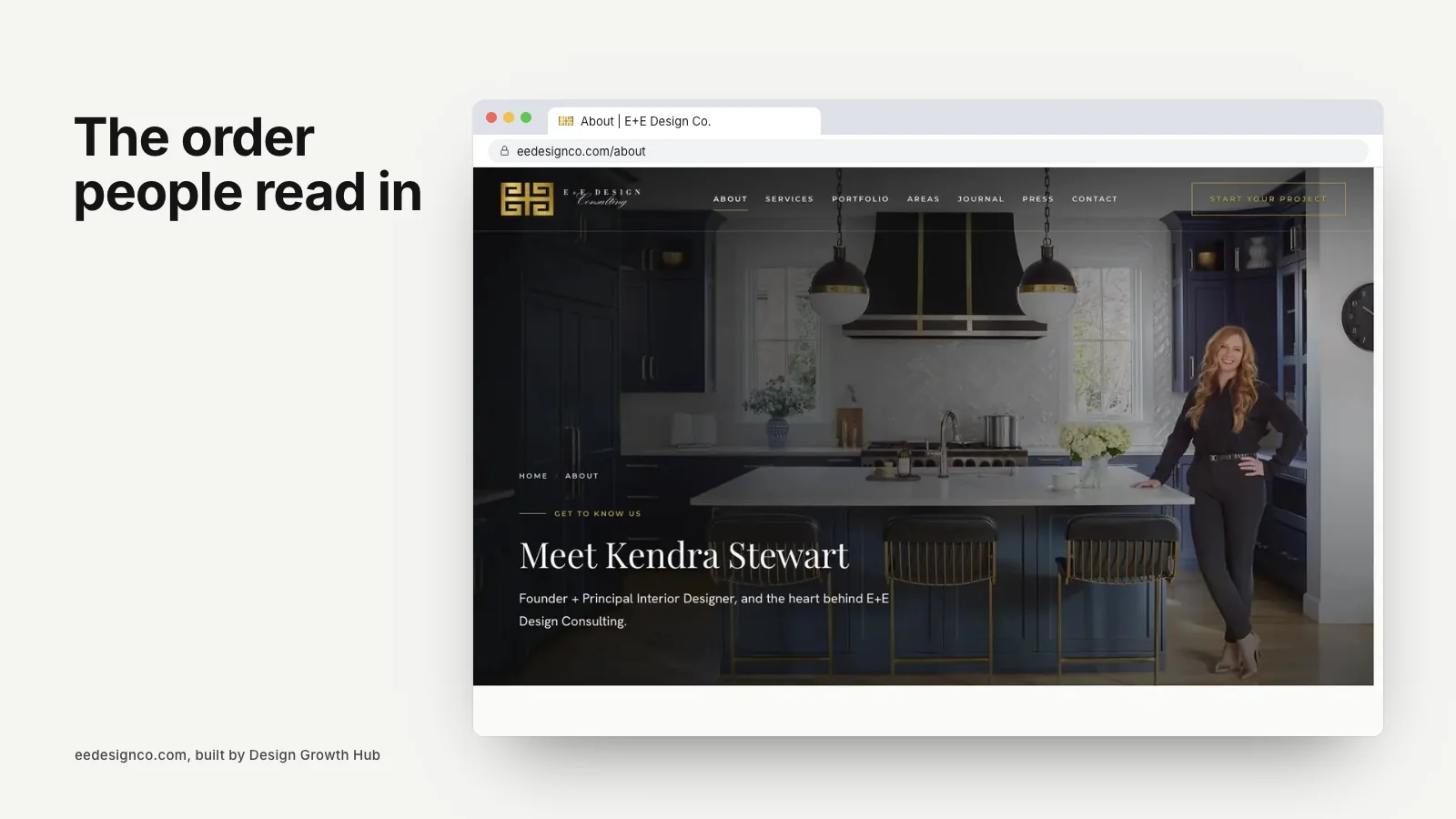
- Approach: a few sentences about how you work, perhaps with a portrait.
- Proof: press logos, a testimonial or two and any relevant memberships.
- Invitation: a simple prompt to start a conversation, linked to your contact page.
This is not a rigid template. Some studios lead with press, others with a short introduction. But each section should answer a question, and the order should feel natural. Our guide to what to put on an interior design website home page goes deeper into each part.
Project page layout
Project pages work best when every one follows the same pattern, so visitors learn how to read them. A reliable structure is a wide opening image, a short introduction, a set of project facts, two to four paragraphs of story and then a paced gallery with captions. End with links to related projects and a gentle invitation.
Consistency matters more than variety here. If one project page is a long gallery and the next is a short slideshow, visitors lose their bearings. Our collection of interior design portfolio examples shows this structure across several studios.
Service page layout
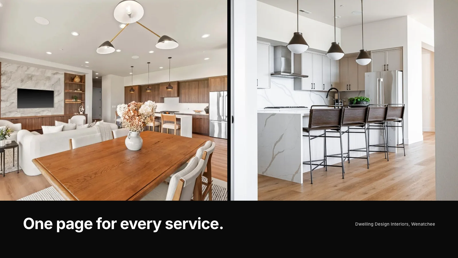
Each service deserves its own page with a predictable structure: who it is for, what is included, how the process works, two or three matching projects, common questions and an invitation to inquire. Service pages are often where visitors decide whether you are a fit, so they should answer practical questions honestly.
They are also some of the most important pages for search, because they match what people type into Google. Our article on why studios need service pages, not just a portfolio explains why.
Navigation that stays out of the way
Keep the main menu short. Five or six items is usually plenty: Work, Services, About, Press or Journal and Contact. Put your contact link in a consistent place, often as a distinct button at the top right, so it is always one tap away.
On phones, check that the menu opens smoothly, that links are easy to tap and that the contact button is still visible. Many studios design navigation for a large screen and forget that most first visits happen on a phone.
Where calls to action belong
A call to action is simply an invitation to take the next step. Place one in the opening screen, one after the services section, one at the end of each project and service page and one in the footer. Use the same wording each time so visitors recognize it.
Avoid filling pages with competing buttons. "Book a call", "Download our guide", "Follow us" and "Shop now" all on one screen make it harder to choose. One primary action per page keeps things clear.
The contact page as part of the layout
The contact page is the end of the journey, so its layout matters as much as the home page. Keep the form short, explain what happens after someone submits it and offer an alternative such as email. If you want to qualify inquiries, our guide to an interior design client intake form shows how to ask useful questions without making the form feel like paperwork.
Layout details that make a difference
Small layout choices add up to a site that feels calm and considered:
- Comfortable text width, so lines are not too long to read easily.
- Generous spacing between sections, so each idea has room.
- Consistent image ratios within each page.
- Headings that describe what follows, not clever phrases.
- A footer with your service areas, contact details and key links.
Headings are worth a special mention. Clear, descriptive headings help visitors scan and help Google and AI tools understand each page. Our guide to making an interior design website AI-readable covers this in more detail.
When the layout is the problem
If your site has strong work but few inquiries, layout is often part of the reason. Common issues include burying services, hiding the contact page, using vague headings and letting the home page run as a long gallery with no clear sequence. Our article on why beautiful interior design websites still fail looks at these patterns in depth, and our list of website ideas that bring real inquiries offers quick fixes.
If you would like a fresh layout planned around your studio, our website redesign service starts with exactly this map. You can also request a studio review and we will point out where your current layout is losing people.
Turn your website into a visibility asset
A website can be a brochure or an asset that brings clients. We help design studios build the second kind.
Request a Studio Review