An interior design landing page is a single, focused page built for one type of visitor and one action, usually a consultation inquiry. Unlike a home page, which introduces the whole studio, a landing page removes distractions and answers only the questions that matter to that visitor. It is most useful when you run ads, send an email campaign or promote a particular service.
Here is how to plan, write and design one that respects your brand and actually brings inquiries.
When a landing page makes sense
You do not need a landing page for everyday visitors. Your home page, service pages and project pages handle them. Landing pages earn their place when traffic arrives with a specific intent, for example:
- A Meta or Google ad promoting full-service renovations.
- An email to past clients announcing a new service.
- A campaign for a specific location or project type.
- A partnership with a builder or showroom sending referrals.
In each case, the visitor already knows roughly what they are looking for. The landing page continues that conversation rather than starting a new one.
Choose one audience and one offer
The most common mistake is trying to speak to everyone. A landing page for "interior design services" is really just another home page. A landing page for "whole-home renovations in the Western suburbs" can speak directly to the people who want that.
Decide what the visitor is being invited to do. For most studios, it is a consultation or a studio review call. Keep the offer honest and simple. Inflated promises tend to bring the wrong inquiries.
Match the message that brought them there
If your ad says "Planning a whole-home renovation?", your landing page headline should say something very close to that. When the message changes between the ad and the page, visitors feel they have landed in the wrong place. Match the wording, the imagery and the tone.
This also applies to the photography. If the ad shows a kitchen, the landing page should open with that kitchen or one like it.
The sections that do the persuading
A focused design studio landing page often follows this order:
- Headline and opening image: matching the ad and stating who the page is for.
- A short promise: two or three sentences explaining what you do for clients like them.
- Selected projects: three projects of the same type, with short descriptions.
- Process: a brief overview of how working together unfolds.
- Proof: a testimonial, press logos or Google reviews.
- Form: short, friendly and clear about what happens next.
- Common questions: a few honest answers about timing, scope and investment.
Our guide to building trust before a client contacts you explains which proof points carry the most weight.
Remove the exits
A landing page should feel calm and uncluttered. Many studios remove the full navigation menu, leaving only the logo, so visitors are not drawn into the wider site before deciding. Others keep a minimal menu. Either way, avoid links to social media, the shop or unrelated pages near the top. Every extra option makes the main one less likely.
Write a form people will actually complete
Ask only for what you need to reply well: name, email, location or website, what they are planning and an optional budget range. Explain what happens next, such as a reply within two business days with suggested next steps. Our article on why your contact page may be costing you better clients covers the details that make forms feel welcoming rather than bureaucratic.
Make it fast and mobile-first
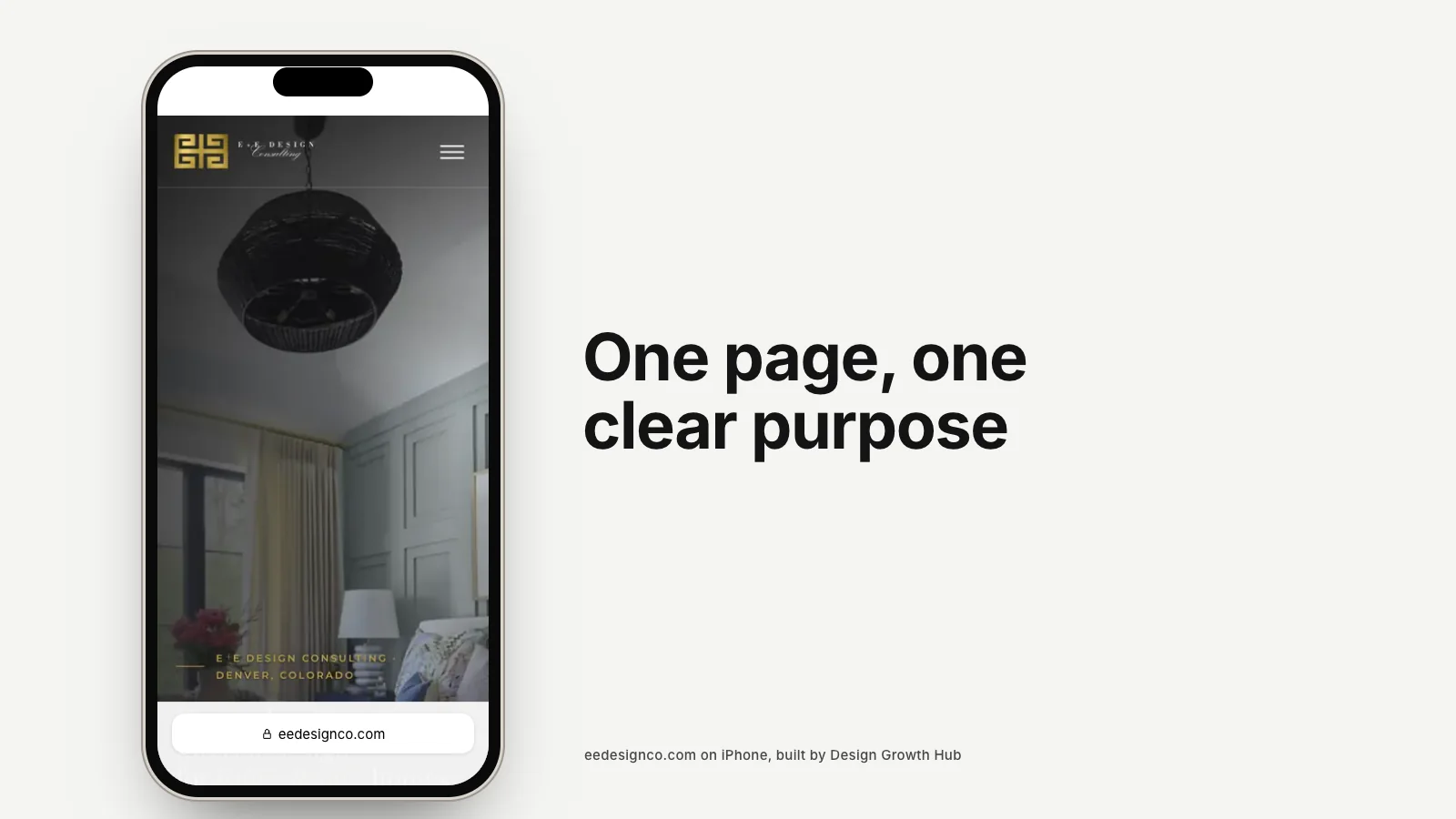
Most ad traffic, especially from Instagram and Facebook, arrives on phones. A landing page that takes several seconds to load wastes the money spent on the click. Keep images compressed, avoid heavy video, put the headline and first image at the top of the screen and make sure the form is easy to complete with a thumb.
Measure what matters
Clicks and page views are not the goal. Track form submissions and, just as importantly, the quality of the inquiries. A landing page that brings fewer but better-matched leads is more valuable than one that fills your inbox with poor fits. Record where each inquiry came from so you can compare campaigns honestly. If you are setting up tracking, our guide to website conversion tracking explains the basics.
Fix the foundations before spending on ads
A landing page can only do so much if the rest of your presence is weak. Visitors often check your main website, Google reviews and Instagram before deciding. Our article on what to fix before running ads lists the essentials. Your home page and portfolio should be ready for that second look.
If you are planning a campaign, our paid ads service includes landing pages built to match your brand and your offer. Or request a studio review and we will look at the page you plan to send traffic to. For more ideas on attracting the right clients, see how to get more interior design clients from your website.
Strengthen your Google + AI visibility
The studios that get found are not always the best. They are the clearest. Let us make yours easier to understand and recommend.
Request a Studio Review