Conversion website design for service firms is design that guides visitors from interest to inquiry. It uses clear visual hierarchy so the most important message is seen first, places proof such as projects, reviews and credentials where decisions happen, structures pages around the questions clients ask, offers a consistent and calm next step on every page and makes forms and contact options effortless on phones. For design and building businesses, good conversion design feels like good hospitality: clear, considered and never pushy.
Here are the principles and how to apply them.
Start with the visitor's questions
Visitors arrive with questions: Is this the right kind of firm? Have they done work like mine? Can I trust them? How do I start? Conversion design answers these in order. Each page should make the next question easy to answer.
Clear hierarchy
Design tells visitors where to look. Use size, spacing and contrast to make the main message prominent, supporting information secondary and the call to action visible. Avoid competing elements of equal weight.
The first screen
The first screen should state what you do, for whom and where, show an image of representative work and offer a clear next step. Our article on what the best closet design websites do well shows how service businesses handle this.
Proof where decisions happen
Place testimonials near service descriptions and contact forms, show relevant projects on service pages and display credentials where they reassure. Proof should appear at the moment visitors decide, not only on a separate page.
Consistent calls to action
Use one primary call to action, worded consistently, such as "Request a consultation" or "Tell us about your project." Place it in the navigation, after key sections and at the end of pages. Avoid many competing actions.
Forms that feel easy
Keep forms short, label fields clearly, explain what happens next and design for phones. Optional qualifying questions can improve fit. Our article on making your website qualify better clients explains how.
Structure supports conversion
Good structure guides visitors from home to service to project to contact. Our article on what website architecture means explains how structure supports both visitors and search engines.
Speed and mobile design
Conversion design must be fast and mobile-friendly. Slow pages and awkward layouts lose visitors before they see your best work.
Calm, not pushy
High-value clients dislike pressure. Avoid aggressive pop-ups, countdown timers and repeated interruptions. Confidence and clarity convert better than urgency.
Design for different visitor stages
Some visitors are ready to inquire; others are researching. Offer clear paths for both: an inquiry for those ready, and helpful content or a way to stay in touch for those who are not.
The conversion funnel
Think of visitors moving through stages: arriving, exploring, trusting and acting. Our article on the website conversion funnel explains how design supports each stage.
Measuring design decisions
Track inquiries by page and source. Our article on what a good conversion rate looks like explains how to interpret results. Judge design by whether it brings more well-matched inquiries.
Working with a designer
If you hire a designer, discuss conversion goals from the start. Our article on what website design services include explains what to expect.
Typography and readability
Conversion depends on reading. Use readable type sizes, comfortable line lengths and strong contrast. Light gray text on white or tiny captions may look refined but make it harder for visitors to absorb your message and act. Headings should describe what follows so visitors can scan quickly.
Images that support the message
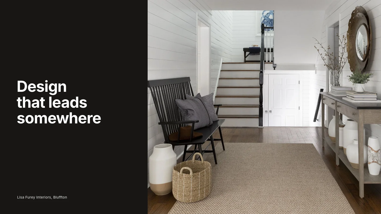
Images should show the kind of work the page describes. On a service page for kitchens, show kitchens. On a page for new construction, show finished new homes. Relevant imagery reassures visitors that they are in the right place and helps them picture working with you.
Trust near the form
The contact page is where hesitation peaks. Add a short testimonial, a real photo of the person who will reply, a note about how quickly you respond and a line about privacy. These small elements can noticeably increase completed inquiries.
Navigation that never traps visitors
Every page should offer a way forward: to related projects, services or contact. Dead ends, such as project pages with no links, lose visitors who were interested but unsure where to go next.
Consistency across the site
Use the same button styles, wording and layout patterns throughout. Consistency helps visitors learn how the site works and makes the next step feel familiar wherever they are.
Testing with real people
Ask someone unfamiliar with your business to find a service, look at a relevant project and send an inquiry while you watch. Their hesitations reveal design problems that analytics cannot explain.
Clear page purposes
Give every page one main job, whether that is explaining a service, telling a project story or inviting contact, and design around it.
Common mistakes
- Beautiful pages with no clear next step.
- Proof hidden on separate pages.
- Too many competing buttons.
- Long, demanding forms.
- Slow, heavy pages.
If you would like a website designed to turn visitors into inquiries, our website redesign service focuses on conversion for service firms. Or request a studio review to see where your site loses visitors.
Conversion design is ultimately about respect: respecting visitors' time, answering their questions and making it easy to take the next step when they are ready.
Fix the structure behind your website
Beauty gets attention. Structure gets discovery. We help you build both, so the right clients arrive ready.
Request a Studio Review