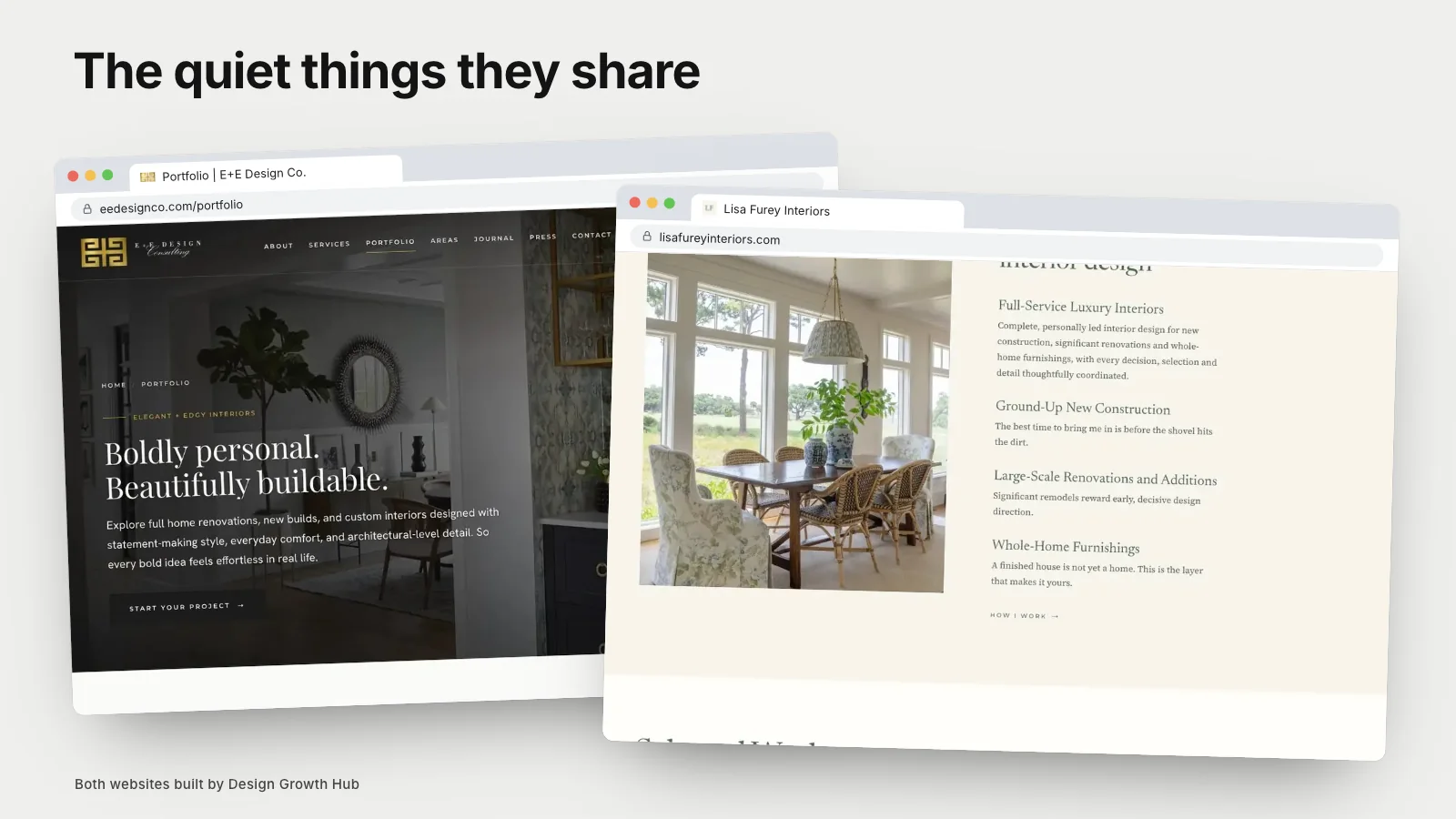
Look at enough interior designer websites and a pattern appears. The ones that bring steady, well-matched inquiries are not always the most dramatic. They share a handful of quiet habits that make them easy to understand, easy to trust and easy to act on.
Here is what those websites have in common, and how to tell whether yours does too.
They say what the studio does in one breath
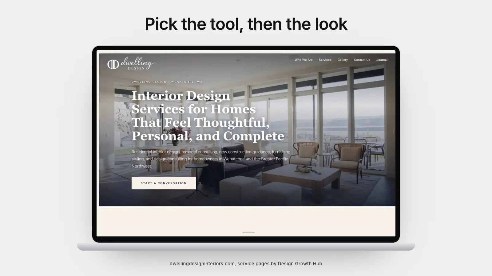
Within the first screen, the best interior designer websites answer three questions: what kind of design you do, for whom and where. It might be one sentence under the logo or a short line above the first photo. Either way, nobody has to scroll to understand the studio.
Compare "timeless interiors for modern living" with "full-service interior design for renovations and new builds in Denver". The second is less poetic and far more useful, both for a homeowner and for search engines trying to understand your business.
They show fewer projects, told better
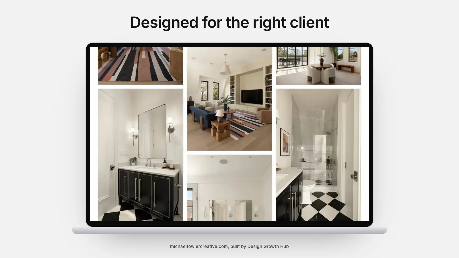
Strong sites rarely show every project you have ever completed. They choose the work that represents the clients you want more of and give each one its own page with real context: location, scope, the brief and what changed. A short paragraph about the challenge does more for credibility than twenty extra photos.
If you are deciding how to organize your work, our guide to interior designer website design explains how to put your best-fit projects forward.
They separate services instead of blending them
Many design studios list everything on one services page. The better sites give each core service its own page, such as full-service design, kitchen and bath remodels or new construction collaboration. Each page explains who it is for, what is included and shows matching projects.
This helps visitors find themselves quickly. It also gives Google and AI tools clear, separate pages to point to when someone searches for that specific service, which a single combined page cannot do.
They make the person behind the studio visible
High-end clients hire people as much as portfolios. The best websites include a warm, specific about page with real photos of the designer or team, their background and how they like to work. They avoid generic biographies and write the way the designer actually speaks.
They are calm, fast and easy on a phone
You will notice that strong designer websites tend to look restrained: plenty of space, consistent image sizes, readable text and simple navigation. They also load quickly despite heavy photography, because images are properly sized and compressed.
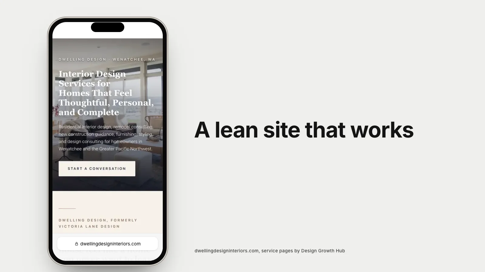
Most first visits now happen on a phone. A site that looks elegant on a large screen but breaks on mobile quietly loses people every day. It is worth checking your own site on your phone today, from the home page to the inquiry form.
They prove their reputation without bragging
Testimonials in clients' own words, links to genuine Google reviews, a tidy press section and memberships listed plainly. The best sites let evidence do the talking and avoid inflated claims. A single sentence from a client describing how calm the process felt is more persuasive than a paragraph of adjectives.
They are built on a platform that fits the studio
Some excellent designer websites run on builders like Squarespace or Showit. Others are custom. What they share is a platform chosen for how the studio works: how often projects are added, how many pages are needed and how much control over design and structure matters. Our articles on choosing a website builder as an interior designer and a builder versus a designer explain the trade-offs. Freelance designers have a slightly different starting point, covered in the right website for a freelance interior designer.
They are written so machines can read them too
This is the newest habit, and the one most studios miss. Search engines and AI assistants cannot interpret images on their own. They rely on page titles, headings, written project descriptions, alt text and structured data. The websites that show up in Google and get mentioned by AI tools tend to have this written layer in place. Our guide to making an interior design website AI-readable walks through it.
The mistakes they avoid
It is just as useful to notice what strong designer websites leave out. They avoid long introductions about passion and creativity that could describe any studio. They avoid sliders that rotate before anyone can read them. They avoid hiding the contact page in a footer, asking for a phone call before an email or requiring a visitor to download a PDF to understand services.
They also avoid letting the site go stale. A portfolio that ends three years ago, a press page with broken links or a team page listing people who have left all quietly suggest a studio that is not paying attention. None of these problems is dramatic on its own. Together they make a beautiful website feel neglected, and high-end clients notice neglect.
How to check your own website against these habits
Open your site on your phone and ask a friend outside the industry to answer five questions in under a minute. What does this studio do? Where? For whom? What projects are similar to mine? How do I get in touch? Wherever they hesitate is where your website needs attention.
If you would like a professional view, request a studio review. We look at design, structure and visibility together and email you a recommended next step, whether that is a refresh or a full website redesign.
Fix the structure behind your website
Beauty gets attention. Structure gets discovery. We help you build both, so the right clients arrive ready.
Request a Studio Review